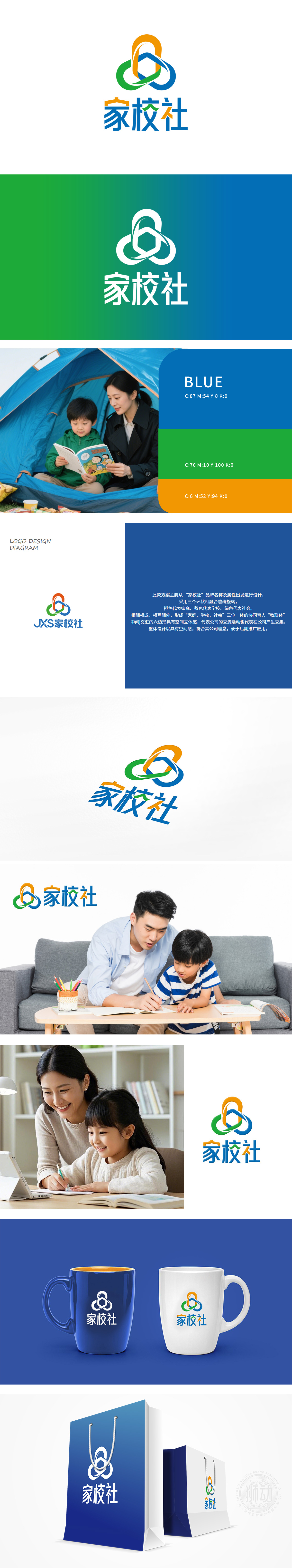
狮动设计受佑宁公司委托橙色、蓝色、绿色分别象征活力、智慧、成长,动态环扣设计精准传递协作纽带感。字体采用定制无衬线体,简洁现代,与图形色彩呼应,强化辨识度。方案交付后获家校社高度认可,成为其品牌形象传播的核心载体,展现狮动对教育领域视觉语言的深度理解与创新表达。
The home school agency commissioned Lion to design the brand logo, and the project focused on the concept of "family, school and society". Lion Dance takes the three-color interwoven ring as the core element, orange, blue and green symbolize vitality, wisdom and growth respectively, and the dynamic ring buckle design accurately conveys the sense of cooperation and bond. The font adopts custom sans serif, which is simple and modern, echoes the color of the graphic and strengthens the recognition. After delivery, the scheme was highly recognized by the home and school clubs, and became the core carrier of its brand image communication, showing Lion Dance's deep understanding and innovative expression of visual language in the field of education.


扫码或拨打添加客服微信


