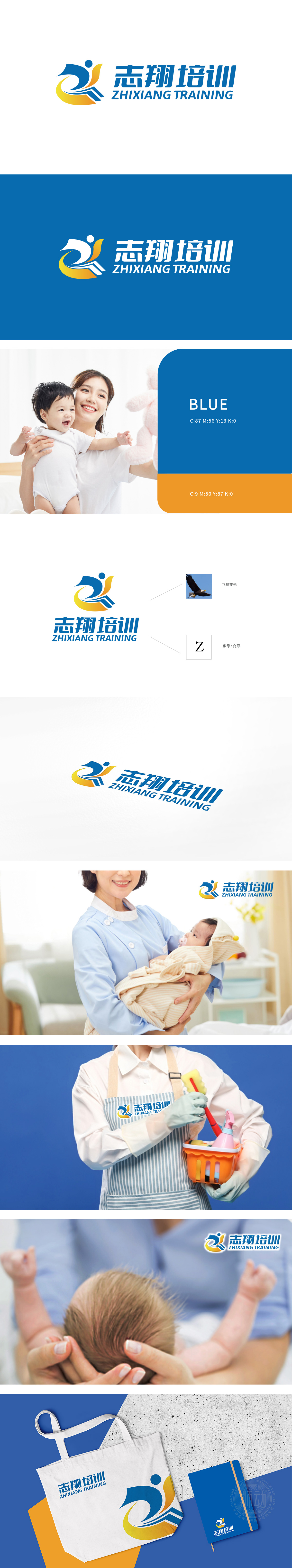
狮动为志翔公司设计的logo以抽象人形为核心,通过蓝黄渐变传递活力与专业的双重特质。动态姿态象征学员突破自我、持续成长,线条流畅强化现代感。中英文标识结合提升国际视野,整体设计精准契合职业培训的进取理念。志翔公司高度认可该方案,认为其不仅提升品牌形象,更直观传达了“赋能职场,展翅翱翔”的价值观。
The logo designed by Lion Motion for Zhixiang Company takes the abstract human figure as the core, and conveys the dual characteristics of vitality and professionalism through the gradual change of blue and yellow. The dynamic posture symbolizes the students' breakthrough and continuous growth, and the smooth lines strengthen the sense of modernity. The combination of Chinese and English logos enhances the international vision, and the overall design accurately fits the enterprising concept of vocational training. Zhixiang Company highly recognizes the scheme, believing that it not only enhances the brand image, but also intuitively conveys the values of "Empowering the workplace and soaring".


扫码或拨打添加客服微信


