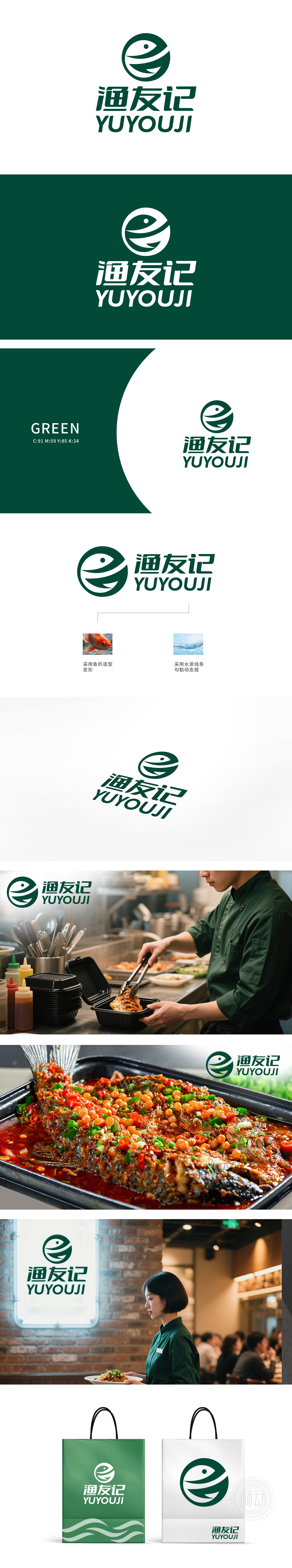
渔友记公司委托狮动设计品牌LOGO,狮动精准捕捉其“联结渔友、共享乐趣”的核心理念。设计师以鱼形为主体,融入水波线条勾勒动态感,深绿色调传递自然与活力。圆形轮廓凝聚品牌凝聚力,拼音与汉字组合强化辨识度。简洁而灵动的视觉语言,让LOGO在众多渔业品牌中脱颖而出。渔友记对设计成果高度认可,称赞狮动“将抽象理念转化为直击人心的视觉符号”。
Yuyouji Company commissioned Lions to design the brand LOGO, and Lions accurately captured its core concept of "connecting fishermen and sharing fun". The designer takes the fish shape as the main body, blends in the water wave lines to outline the dynamic feeling, and the dark green tone conveys nature and vitality. The circular outline condenses the brand cohesion, and the combination of pinyin and Chinese characters strengthens the recognition. Simple and agile visual language makes LOGO stand out among many fishery brands. Yu You Ji highly recognized the design results and praised Lion Motion for "transforming abstract ideas into visual symbols that directly hit people's hearts".


扫码或拨打添加客服微信


