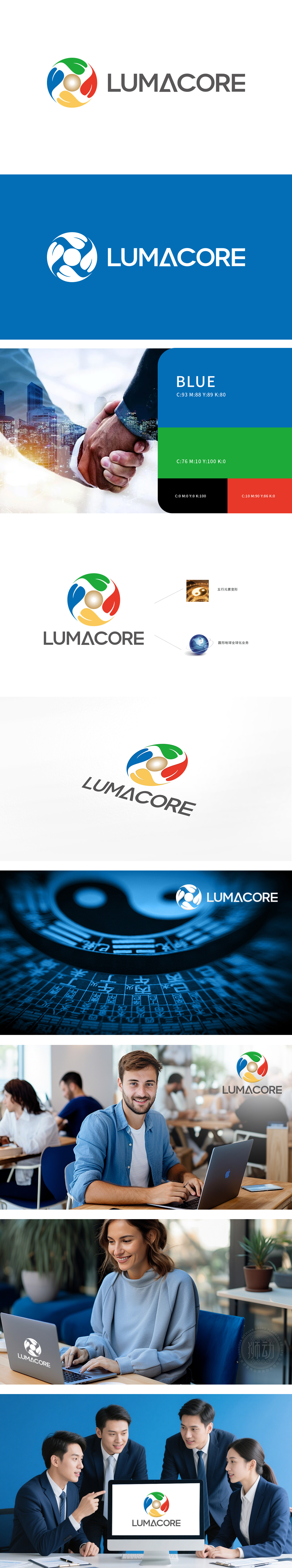
光枢启曜公司委托狮动设计品牌Logo,打造成为业界标杆。狮动团队深度挖掘“光能量与核心枢纽”理念,以渐变色环形演绎光能流转,金色内核象征能量聚核;中西文标识简洁大气,兼具科技感与东方韵味。客户高度赞赏设计将品牌愿景精准可视化,上市后品牌辨识度大幅提升,市场反响热烈。狮动以策略性设计与美学创新,成功为品牌资产赋能,展现卓越设计力。
Guangshu Qiyao Company commissioned Lion Motion to design the brand Logo, and the results are amazing. Lion Movement Team Digs Deep into "Light Energy and Core Hub""Concept, deducing the light energy flow in a gradient ring, and the golden core symbolizes energy gathering; Chinese and western logos are concise and atmospheric, with a sense of science and technology and the East.Charm. Customers highly appreciate the design to accurately visualize the brand vision. After listing, the brand recognition has been greatly improved and the market response has been enthusiastic. The lion moves by strategy


扫码或拨打添加客服微信


