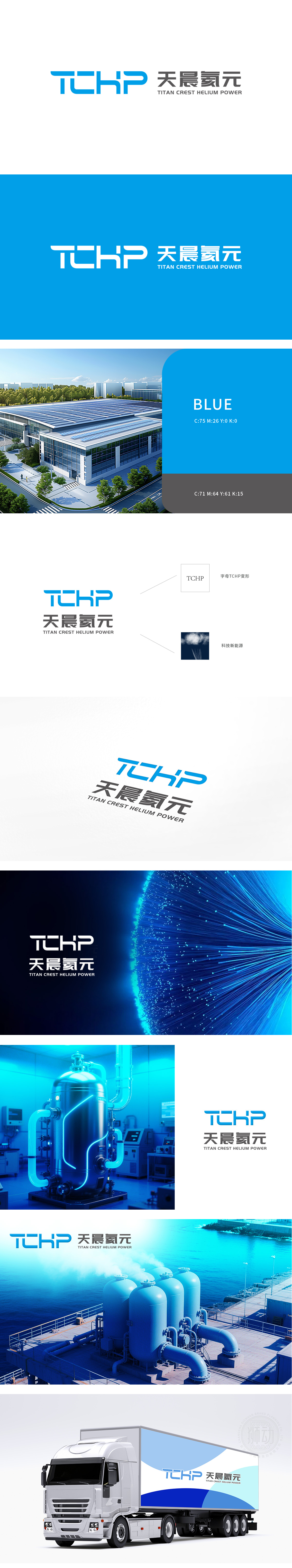
天晨氦元logo设计项目中,狮动精准洞察能源科技行业特性,以“TCHP”字母组合构建核心视觉符号,蓝色渐变呈现科技感与稳定性。将中文“天晨氦元”与英文全称分层布局,既强化品牌本土属性又彰显国际视野。整体造型简洁锐利,如离子流般动态线条象征能源活力,灰白底色烘托专业质感。设计高效传递品牌“创新、高效、可靠”的核心价值,助力天晨氦元在市场中树立独特形象。
In Tianchen Helium logo design project, Lion Motion has a precise insight into the characteristics of the energy technology industry, and builds a core visual symbol with the letter combination of "TCHP", and the blue gradient presents a sense of technology and stability. The layered layout of Chinese "Tianchen Helium Yuan" and English full name not only strengthens the local attributes of the brand but also highlights the international vision. The overall shape is simple and sharp, and the dynamic lines like ion flow symbolize energy vitality, and the gray background contrasts the professional texture. The design efficiently conveys the core value of the brand "innovation, efficiency and reliability" and helps Tianchen Helium to establish a unique image in the market.


扫码或拨打添加客服微信


