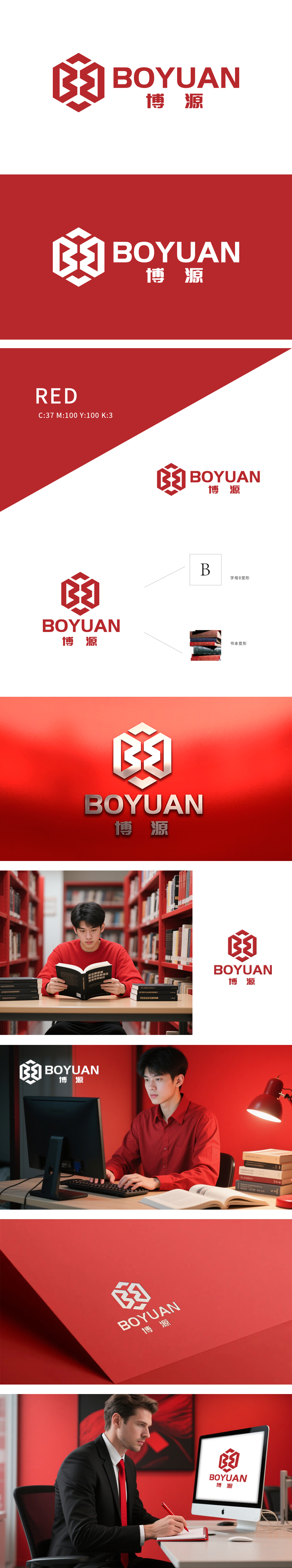
博源公司委托狮动设计品牌logo,狮动团队深度调研其行业特性与品牌理念,以几何图形抽象呈现“博源”的稳健与创新。红色立方体象征行业根基与前瞻视野,黑白文字强化专业调性。设计兼具视觉冲击力与品牌辨识度,精准传递企业价值观。博源公司对成果高度认可,称其“完美平衡品牌特质与市场审美”。狮动以专业洞察与创意执行,助力客户品牌形象升级。
Case study: Boyuan Company commissioned Lion Sports to design the brand logo, and the Lion Sports team conducted in-depth research on its industry characteristics and brand concept, and abstractly presented the robustness and innovation of Boyuan with geometric figures. The red cube symbolizes the industry foundation and forward-looking vision, and the black and white text strengthens the professional tonality. The design has both visual impact and brand recognition, and accurately conveys corporate values.


扫码或拨打添加客服微信


