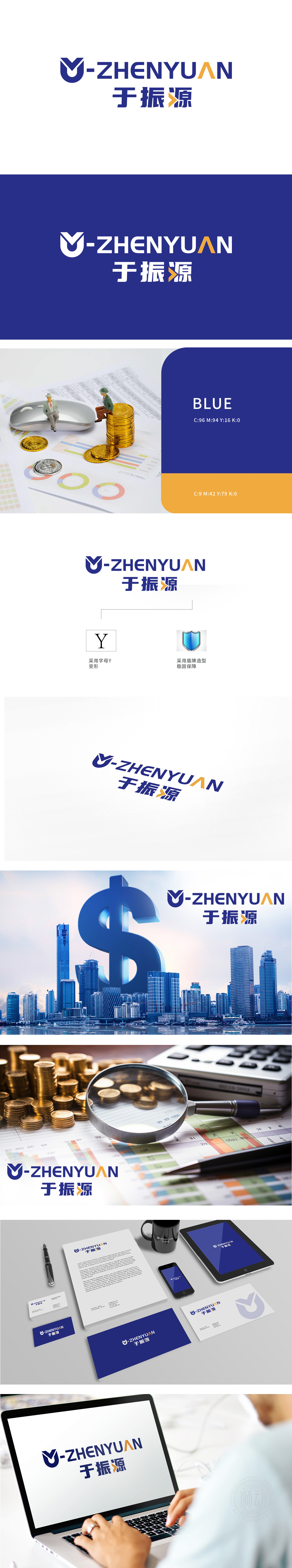
狮动为于振源公司设计的保险行业logo,以盾牌造型传递安全信赖,蓝黄配色彰显专业与活力。字母“M”的抽象化处理,既呼应品牌名称,又象征稳固保障。整体设计精准契合保险行业核心价值,在于振源公司投放市场后,品牌识别度显著提升,客户信任感增强。狮动以专业洞察与创意表达,助力企业快速建立行业影响力,成为保险品牌设计的标杆案例。
The insurance industry logo designed by Lion Motion for Yu Zhenyuan Company conveys safety and trust with shield shape, and the blue and yellow color scheme highlights professionalism and vitality. The abstraction of the letter "M" not only echoes the brand name, but also symbolizes the stable guarantee. The overall design accurately fits the core value of the insurance industry, because after Zhenyuan Company was put into the market, the brand recognition was significantly improved and the customer trust was enhanced. With professional insight and creative expression, Lion Motion helps enterprises to quickly establish industry influence and become a benchmark case for insurance brand design.


扫码或拨打添加客服微信


