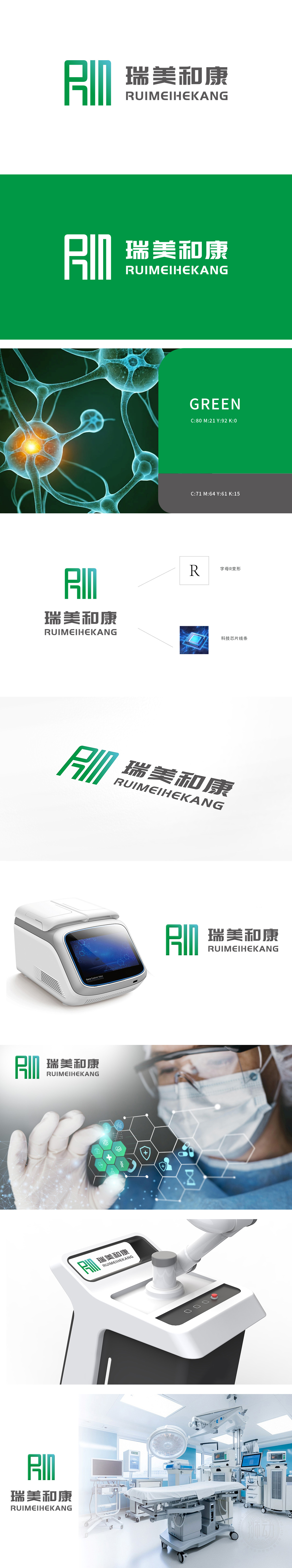
狮动为瑞美和康设计的LOGO以绿色渐变为主色调,象征健康与生机。左侧“RMH”字母通过艺术化变形,既强化品牌记忆点,又传递专业信赖感;右侧中英文组合兼顾国际化与本土化需求。整体设计简洁大气,精准契合医疗行业特性。上线后,瑞美和康品牌辨识度显著提升,客户信任感增强,成功助力企业树立权威可靠的医疗品牌形象。
The LOGO designed by Lion Motion for Ruimei and Kangkang is mainly based on green gradient, symbolizing health and vitality. The letter "RMH" on the left is artistically deformed, which not only strengthens the brand memory, but also conveys the sense of professional trust; The combination of Chinese and English on the right gives consideration to the needs of internationalization and localization. The overall design is simple and atmospheric, which accurately fits the characteristics of the medical industry. After the launch, the brand recognition of Ruimei Hekang was significantly improved.


扫码或拨打添加客服微信


