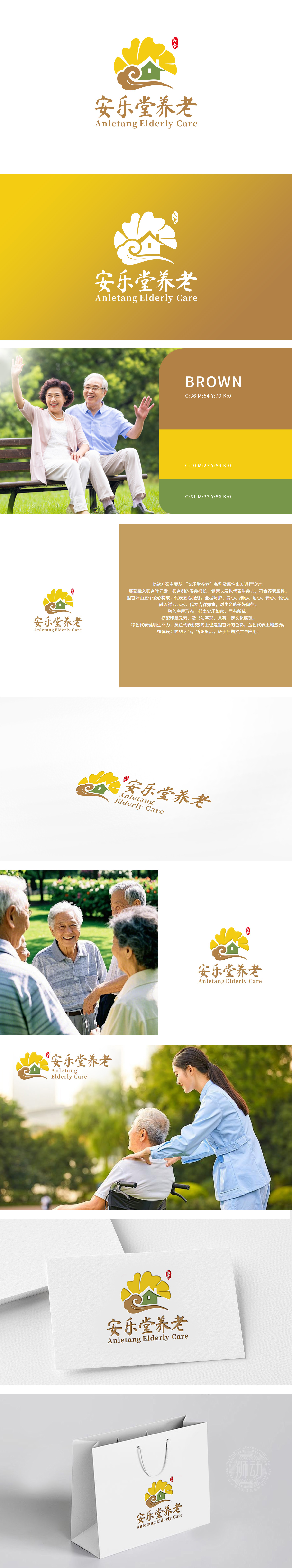
狮动为安乐堂养老公司设计的LOGO,以“温暖关怀与自然和谐”为核心理念。图形中,阳光般的黄太阳象征希望与活力,绿房子传递安全与温馨,棕色波浪形融入自然元素,隐喻生命绵延。中英文字体简洁大气,强化专业信赖感。整体色调温暖协调,精准捕捉养老品牌的核心价值。设计交付后,客户对狮动“从品牌理念到视觉符号的转化能力”给予高度认可,该LOGO已成为安乐堂传递服务温度的鲜明标识。
The LOGO designed by Lion Motion for Anletang Pension Company takes "warm care and natural harmony" as its core concept. In the figure, the sunny yellow sun symbolizes hope and vitality, the green house conveys safety and warmth, and the brown waves blend into natural elements, which symbolizes the continuation of life. Chinese and English fonts are concise and atmospheric, which strengthens professional trust. The overall tone is warm and harmonious, accurately capturing the core value of the pension brand. After the design was delivered, the customer highly recognized Lion Motion's "transformation ability from brand concept to visual symbol", and the LOGO has become a distinctive symbol of the service temperature delivered by Anletang.


扫码或拨打添加客服微信


