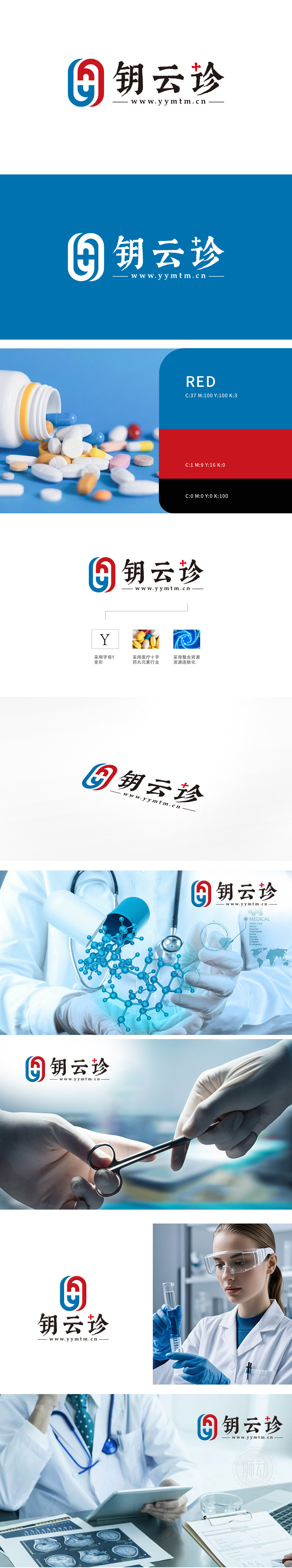
狮动为钥云诊设计的logo完美融合医药行业核心价值。以红蓝盾牌造型传递专业与安全,白色十字精准呼应医疗属性。简洁线条勾勒现代科技感,配色对比强化品牌辨识度。狮动团队深入挖掘钥云诊“精准整合医疗信息”理念,将企业使命转化为视觉符号,最终呈现的logo既彰显行业特质,又塑造独特品牌记忆点,助力钥云诊速赢得市场信任。
The logo designed by Lion Motion for Keycloud Diagnosis perfectly integrates the core values of the pharmaceutical industry. The red and blue shield shape conveys professionalism and safety, and the white cross accurately echoes the medical attributes. Simple lines outline the sense of modern science and technology, and color matching contrast strengthens brand recognition. The Lion Movement team deeply explored the concept of "precise medical treatment" of Keycloud Diagnosis, and transformed the corporate mission into a visual symbol.


扫码或拨打添加客服微信


