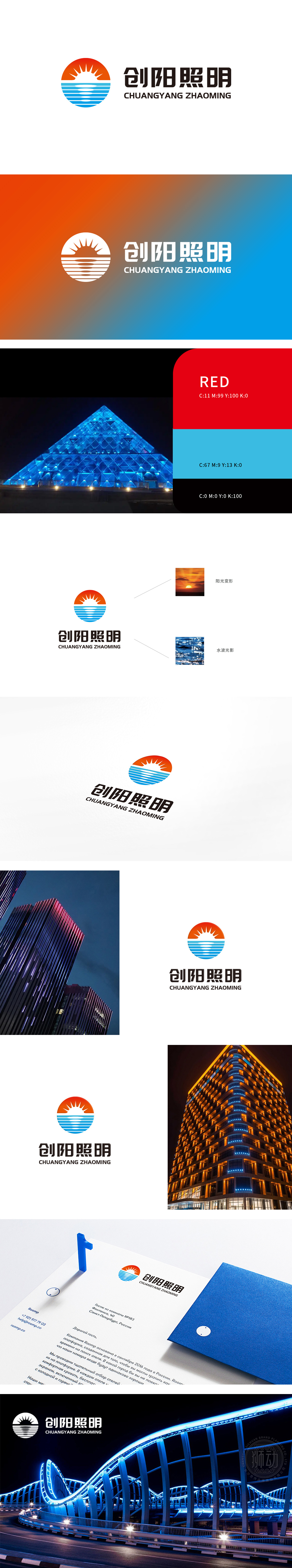
狮动为创阳照明设计的品牌logo,以“光明与未来”为核心理念精准落地。左侧圆形图标融合日出意象,橙红色渐变与放射线条构成跃动太阳,象征创阳照明的行业引领力;蓝色波浪线条勾勒水面,隐喻科技创新的灵动能量。右侧“创阳照明”字体采用工业黑强化专业感,拼音字母增添国际化维度。色彩碰撞构建视觉张力,符号化设计高效传递品牌价值。狮动以战略视觉体系赋能客户,让logo成为照亮市场的超级符号。
The brand logo designed by Lion Motion for Sunlight Lighting accurately landed with the core concept of "Bright and Future". The circular icon on the left fuses the sunrise image, and the orange-red gradient and radiation lines form the leaping sun, symbolizing the industry leading force of Chuangyang lighting; Blue wavy lines outline the water surface, which symbolizes the smart energy of scientific and technological innovation. On the right, the font "Chuangyang Lighting" adopts industrial black to enhance professionalism, and the pinyin letters add an international dimension. Color collision builds visual tension, and symbolic design conveys brand value efficiently.
.


扫码或拨打添加客服微信


