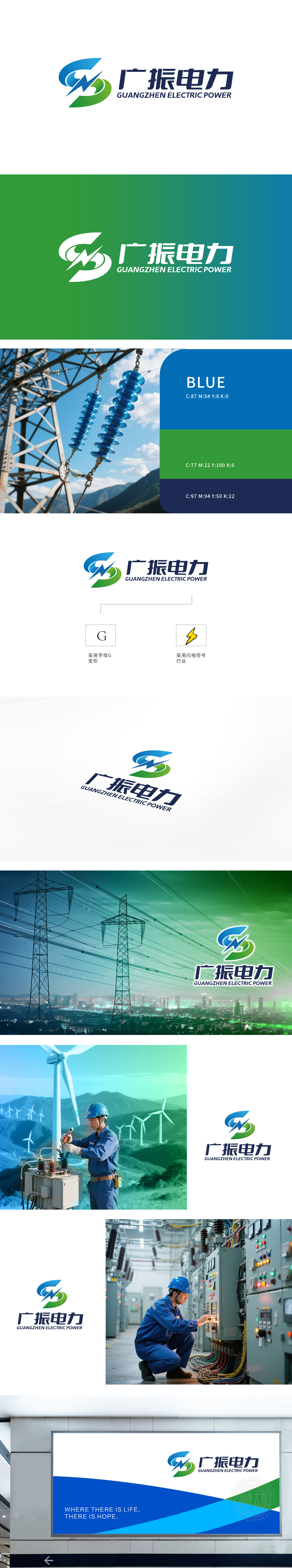
狮动为广振电力设计的LOGO以“能量与创新”为核心理念。左侧图形融合闪电与变形“G”字母,精准传递电力行业的专业属性与品牌基因,蓝色象征科技与稳定,绿色弧形呼应环保理念,动态线条激发无限能量感。右侧中英文字体搭配严谨工整,强化国际视野。整体设计简洁而极具辨识度。从品牌战略到符号创作,狮动以系统化设计思维将客户诉求转化为具有商业价值的视觉资产。
The LOGO designed by Lion Power for Guangzhen Electric Power takes "energy and innovation" as the core concept. The graphic on the left fuses the letters "G" of lightning and deformation, accurately conveying the professional attributes and brand genes of the power industry, blue symbolizes technology and stability, green arc echoes the concept of environmental protection, and dynamic lines stimulate unlimited energy. The Chinese and English fonts on the right side are rigorous and neat, which strengthens the international vision.


扫码或拨打添加客服微信


