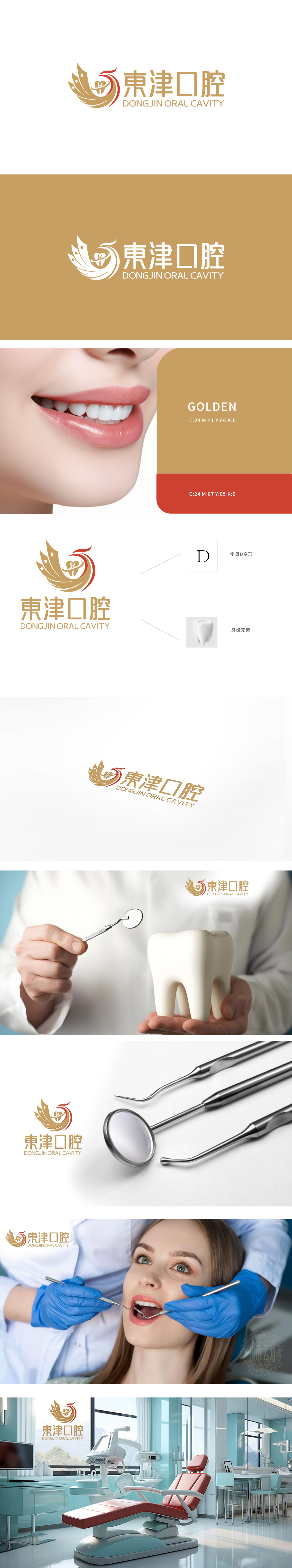
为東津口腔打造的LOGO以金色羽毛与牙齿图标为核心元素,融合动感曲线与红金配色,彰显专业与活力。左侧羽毛象征精准呵护,牙齿图标直指行业特质;右侧中英文字体简洁大气,传递国际化品牌气质。设计巧妙平衡美学与行业属性,红色点睛注入信赖感,整体在纯白背景中脱颖而出。狮动以深度行业洞察与创新视觉语言,助力品牌塑造高端专业形象,强化市场记忆点,让每一次视觉接触都成为品牌价值的传递.
The LOGO for Dongjin Stomatology takes golden feathers and tooth icons as the core elements, and combines dynamic curves with red and gold colors to show professionalism and vitality. The left feather symbolizes precise care, and the tooth icon points directly to the characteristics of the industry; The Chinese and English fonts on the right are concise and atmospheric, conveying the international brand temperament. The design skillfully balances aesthetics and industry attributes, and the red finishing touch injects a sense of trust, and the whole stands out in a pure white background.


扫码或拨打添加客服微信


