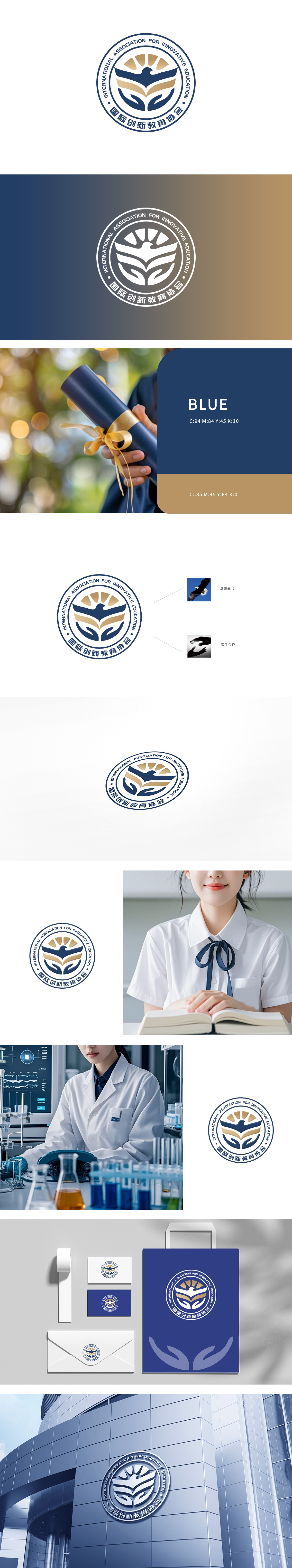
狮动团队深入拆解“教育+创新”核心需求,在品牌设计上打造「知识双翼」视觉体系:LOGO融合书本(教育本质)与飞鸟(全球化视野)造型,用渐变金蓝传递专业与活力;官网用户咨询量暴涨该案例也让新客户直观感受到狮动“从品牌基因挖掘到用户体验落地”的全链路设计实力。
The Lion Movement team deeply dismantled the core demand of "education+innovation" and created a visual system of "knowledge wings" in brand design: LOGO integrated books (educational essence) and birds (global vision), and used gradient gold and blue to convey professionalism and vitality; The case of soaring user consultation in official website also made new customers intuitively feel the full link design strength of Lion Motion "from brand gene mining to user experience landing".


扫码或拨打添加客服微信


