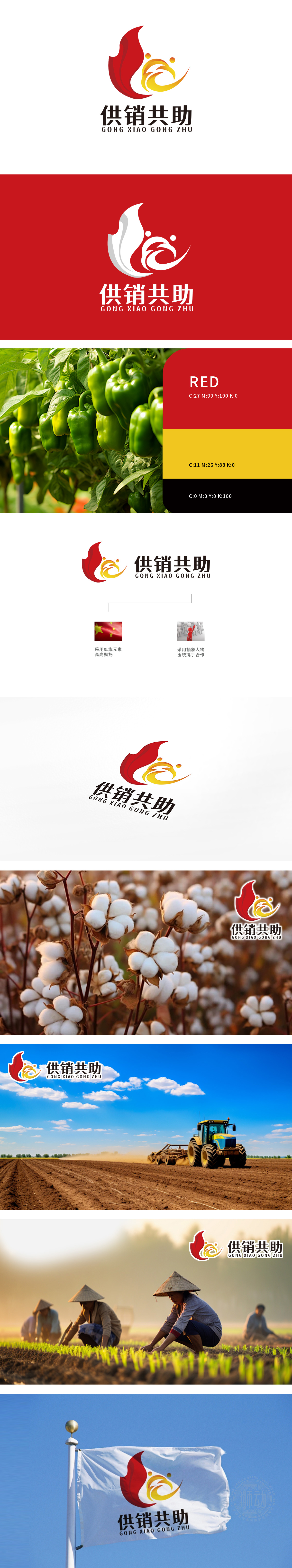
狮动设计打造的“供销共助”LOGO,以视觉语言精准传递品牌核心理念。设计中,左侧红色抽象图形如火焰升腾,象征活力与进取;右侧黄色图形以牵手姿态呈现,诠释合作与共赢。双色碰撞融合,动态线条勾勒出互助共生的力量感,直观呼应“供销共助”的协作精神。拼音与中文的简洁搭配提升辨识度,明亮色调强化品牌亲和力。该设计从行业特质出发,将抽象概念转化为具象符号,获客户高度认可,成为其品牌传播的核心视觉资产。
The "Supply and Marketing Help Together" LOGO designed by Lion Motion accurately conveys the core concept of the brand with visual language. In the design, the red abstract figure on the left side, such as flame rising, symbolizes vitality and enterprising; The yellow figure on the right is presented in a hand-in-hand manner, explaining cooperation and win-win. Two-color collision and fusion, dynamic lines outline the sense of strength of mutual assistance and symbiosis, and intuitively echo the cooperative spirit of "supply and marketing help together". The concise collocation of Pinyin and Chinese enhances the recognition.


扫码或拨打添加客服微信


