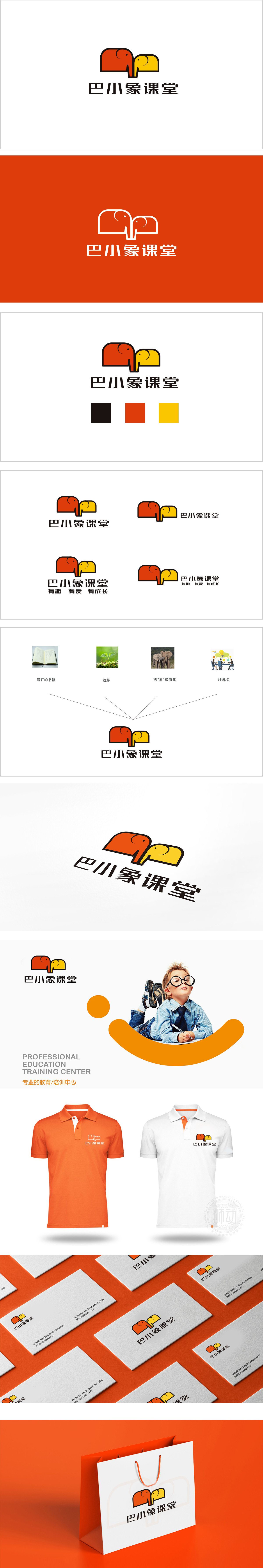
狮动设计通过简洁且有记忆点的“大象语言”,两者以鼻子交叠的方式连接,高识别度:能快速识别;亲和力:圆润的线条和卡通化的造型符合儿童的审美习惯,自带“可爱”“亲切”的属性,降低了教育品牌的距离感;色彩逻辑:红橙色(成年象)传递热情、活力(像老师的引导),明黄色(小象)代表阳光、希望(像学生的成长),两种高饱和度颜色的搭配既活泼又不刺眼,符合儿童视觉感知的舒适度。用“大象互动”讲好教育故事。大象在文化中自带稳重、智慧、陪伴的联想,而两只大象的关系设计,则巧妙传递了“陪伴式成长”的教育理念:把品牌理念“藏”在了图形里,却让每一个细节都在“发光”。
Lionesign adopts the concise and memorable "elephant language", and the two are connected by overlapping noses, which has high recognition: it can be quickly recognized; Affinity: rounded lines and cartoon-like shapes conform to children's aesthetic habits, and they have the attributes of "cuteness" and "friendliness", which reduces the sense of distance of educational brands; Color logic: red and orange (adult elephant) conveys enthusiasm and vitality (like the teacher's guidance), and bright yellow (baby elephant) represents sunshine and hope (like the growth of students). The collocation of two high saturation colors is lively and not dazzling, which is in line with the comfort of children's visual perception.


扫码或拨打添加客服微信


