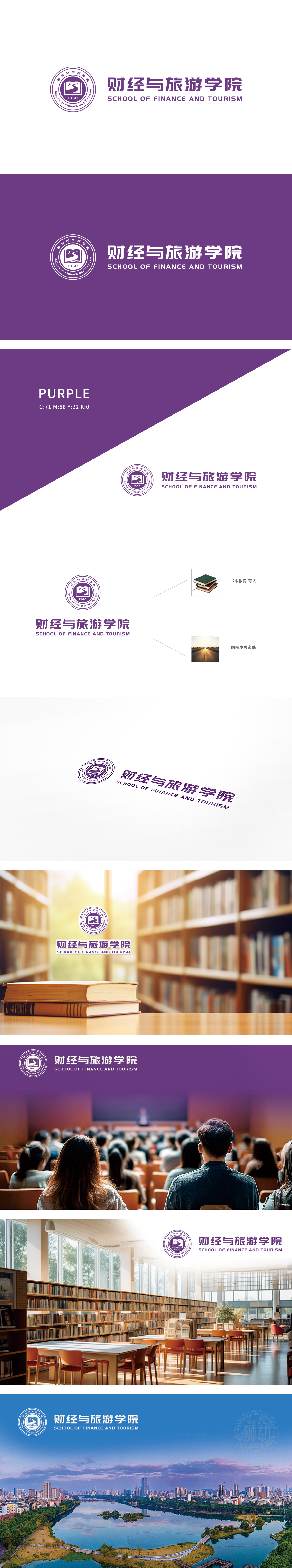
狮动团队精准捕捉“财经+旅游”的行业特质,以打开的书本象征知识传承,山峰图案融入旅游活力,紫色调彰显专业与庄重。巧妙将学院中英文名称与1960年建院历史融于圆形标志,整体简洁大气。客户对设计成果高度认可,称赞狮动“既提炼核心价值,又赋予品牌生命力”,成功助力学院形象升级。
The Lion Movement Team accurately captures the industry characteristics of "finance+tourism", with open books symbolizing knowledge inheritance, mountain patterns blending into tourism vitality, and purple tones highlighting professionalism and solemnity. Ingeniously integrate the Chinese and English names of the college with the history of its establishment in 1960 into a circular symbol, which is simple and atmospheric as a whole.


扫码或拨打添加客服微信


