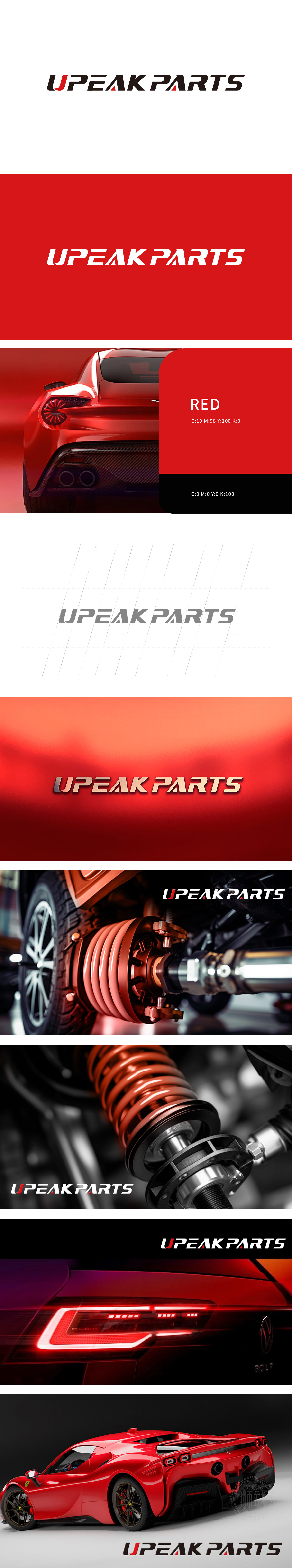
UPEAK PARTS 委托狮动团队设计品牌 LOGO。狮动聚焦“汽配行业专业属性 + 品牌突破力”,以现代极简字体为核心,通过黑红撞色打造记忆点:字母“U”与三角符号的红色点缀,既呼应汽配领域的科技感与活力,又强化视觉冲击;整体线条利落流畅,精准传递“高品质配件服务商”的品牌定位。
UPEAK PARTS entrusts Lion Sports Team to design the brand LOGO. Lion Motion focuses on "professional attributes of auto parts industry+brand breakthrough", takes modern minimalist fonts as the core, and creates memory points through black and red contrast: the letter "U" and the red embellishment of triangle symbols not only echo the sense of science and technology and vitality in the auto parts field, but also strengthen the visual impact; The overall lines are neat and smooth, accurately conveying the brand positioning of "high-quality accessories service provider".


扫码或拨打添加客服微信


