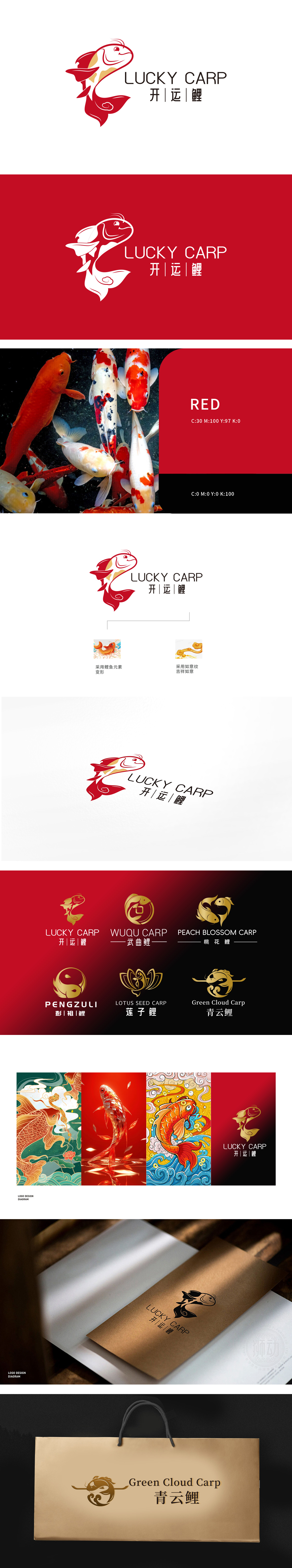
狮动打造 LOGO,以红金锦鲤为核心视觉,灵动身形搭配尾部祥云元素,传递 “运势更进一步” 美好期许。创意呼应 “此地一行非等闲,鸿运当头喜气扬” 的启运活力,更承接 “运势如虹永相随,前程似锦无限好” 的发展愿景。狮动以文化符号 + 商业美学的设计逻辑,助力品牌借开运意象破圈。
Lion moves to create a LOGO, with red gold and koi fish as the core vision, smart body shape and auspicious cloud elements at the tail, conveying the beautiful expectation of "further fortune". Creativity echoes the vitality of "this place and its party are not idle, and lucky strike is beaming", and it also undertakes the development vision of "the fortune is like a rainbow forever, and the future is bright and infinite". With the design logic of cultural symbols and commercial aesthetics, Lion Motion helps the brand to break the circle through the image of luck.


扫码或拨打添加客服微信


