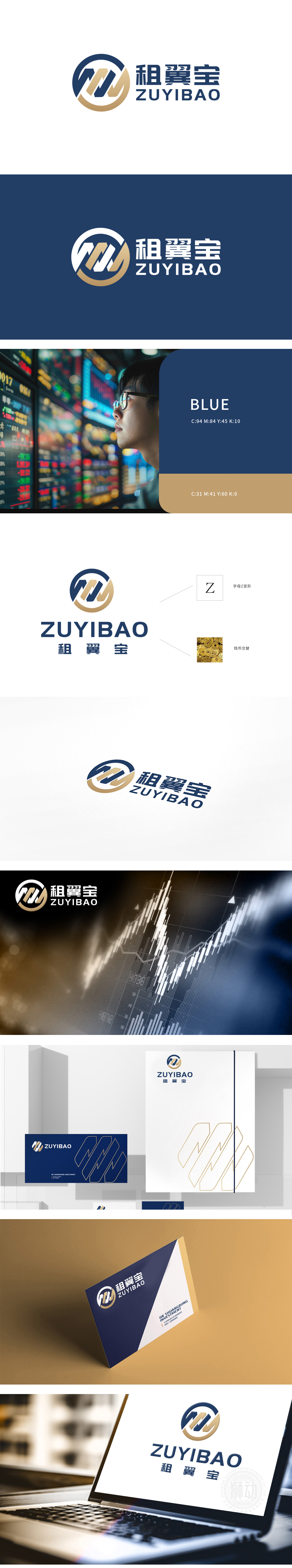
狮动以深蓝与金色为主调,塑造沉稳而富有活力的视觉形象。双“W”交织的图形,既象征合作共赢,又暗含股票涨跌的波动韵律。中文与拼音的简洁排版强化品牌辨识度。客户对设计赞不绝口,新客户亦纷纷赞叹狮动精准捕捉行业精髓,以设计赋能品牌价值。
Lion moves with deep blue and gold as the main tones, creating a calm and dynamic visual image. The figure interwoven with double "W" not only symbolizes win-win cooperation, but also implies the fluctuation rhythm of stock rise and fall. Simple typesetting of Chinese and Pinyin strengthens brand recognition. Customers are full of praise for the design, and new customers have also praised Lion Motion for accurately capturing the essence of the industry and empowering the brand value with design.


扫码或拨打添加客服微信


