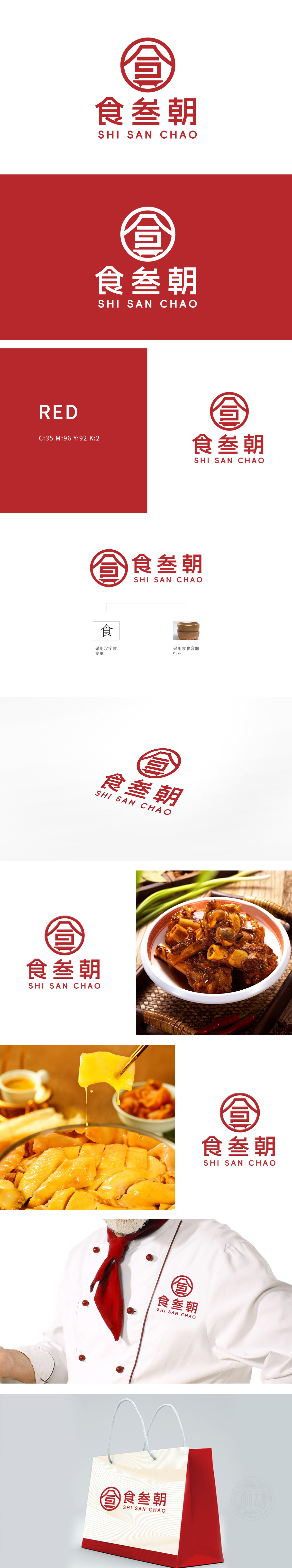
狮动为食品餐饮品牌“食叁朝”设计的LOGO,以“食”字为核心视觉符号,融合传统书法与现代极简美学,红色圆形象征热情与团圆,凸显品牌文化内核。LOGO简洁醒目,强化品牌记忆点,助力客户在竞争激烈的市场中快速建立认知,解锁专属设计解决方案!
The LOGO designed by Lion Motion for the food and beverage brand "Shi San Chao" takes the word "Shi" as the core visual symbol, integrates traditional calligraphy and modern minimalist aesthetics, and the red circle symbolizes enthusiasm and reunion, highlighting the core of brand culture. LOGO is concise and eye-catching, which strengthens brand memory, helps customers to quickly build awareness in the highly competitive market and unlock exclusive design solutions!


扫码或拨打添加客服微信


