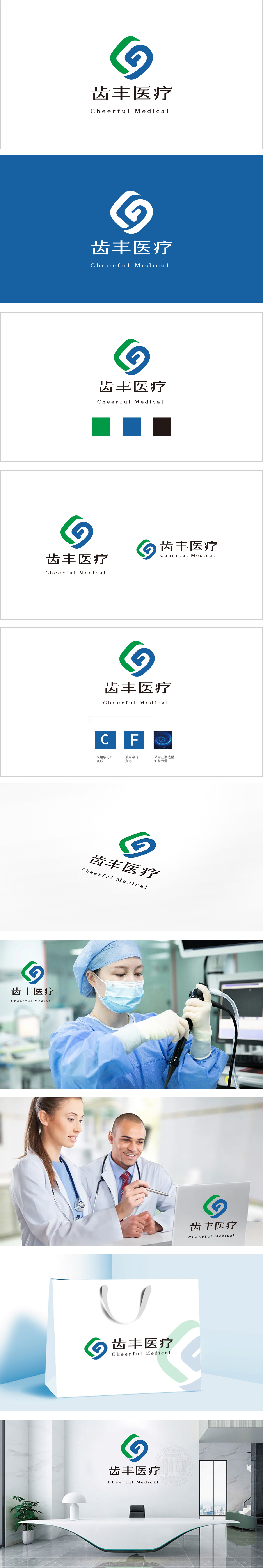
狮动设计采用绿蓝双色的抽象几何曲线,通过符号化的隐喻,精准关联了牙科场景:蓝色曲线:抽象成“牙齿”的轮廓,同时曲线的弧度带有“包裹感”,像一层保护罩——既暗示“牙科诊疗的核心是‘牙齿健康’”,又传递“守护牙齿”的品牌使命。绿色曲线:环绕在蓝色外侧的流动形态,像“生长”或“循环”的意象,对应“健康、自然”的牙科理念。整体造型:用色彩传递“专业+温度”的医疗调性。用符号化的语言、精准的色彩、有情绪的字体,把“齿丰医疗”的品牌定位(专业、温暖、守护牙齿健康)变成了一个“看得见、记得住”的视觉符号。
Lion design uses green and blue abstract geometric curves, which accurately relate to the dental scene through symbolic metaphor: blue curve: abstracted into the outline of "teeth", and at the same time, the curvature of the curve has a sense of wrapping, like a protective cover-which not only implies that "the core of dental diagnosis and treatment is" dental health ",but also conveys the brand mission of" protecting teeth ". Green curve: the flowing form around the outside of blue, like the image of "growth" or "circulation", corresponds to the dental concept of "health and nature". Overall modeling: convey the medical tonality of "specialty+temperature" with color.


扫码或拨打添加客服微信


