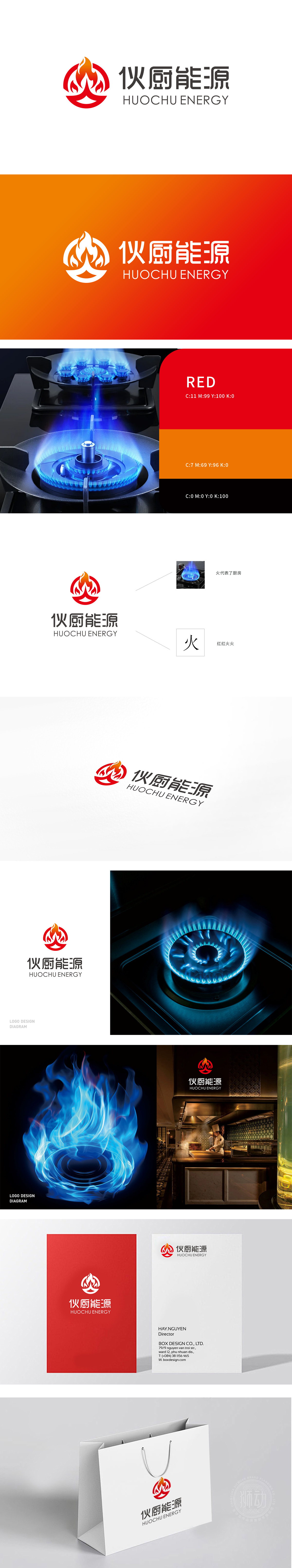
狮动为伙厨能源设计的LOGO令人惊艳!设计师精准捕捉能源行业特性,以火焰图形为核心,通过红黄渐变传递热情与能量,动态圆环增强视觉张力。中英文品牌名称简洁醒目,黑白对比凸显专业质感。整体风格现代大气,既彰显企业活力又强化品牌识别度,完美契合我们的行业定位与品牌形象!
The LOGO designed by Lions for the kitchen energy is amazing! Designers accurately capture the characteristics of energy industry, take flame graphics as the core, transmit enthusiasm and energy through red and yellow gradients, and enhance visual tension through dynamic rings. Chinese and English brand names are concise and eye-catching, and black and white contrast highlights professional texture.


扫码或拨打添加客服微信


