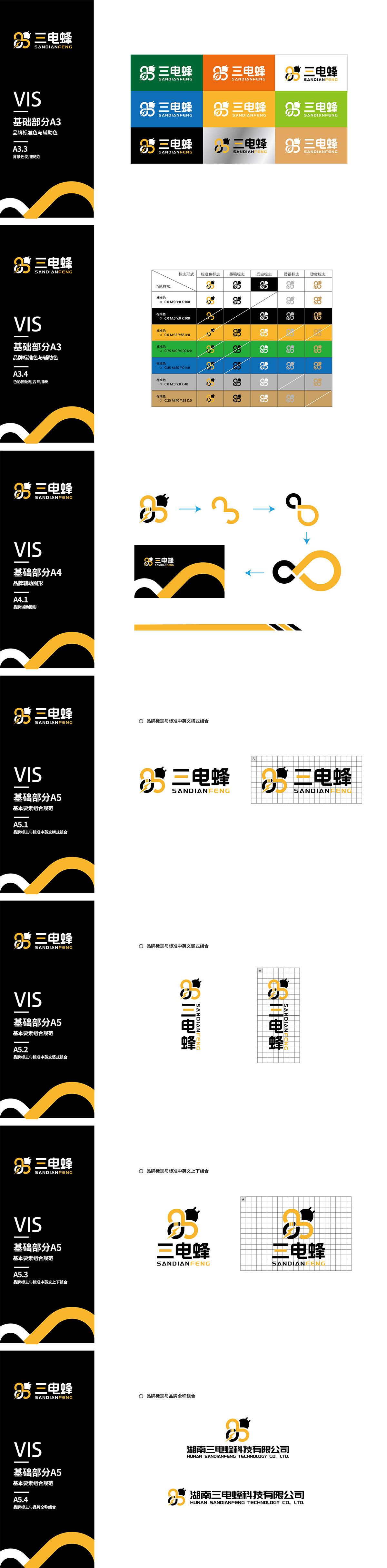
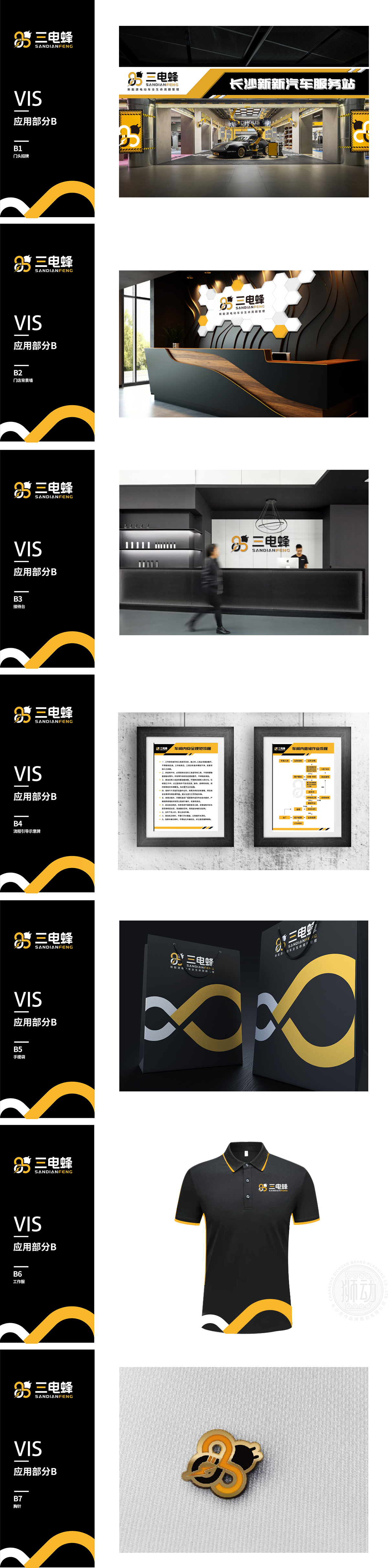
狮动以“能量流动与科技蜂巢”为核心概念,将交织的橙色环形象征高效充电网络,蜂巢结构融入蜜蜂图形,精准传递品牌行业属性与创新活力。简洁现代的视觉语言兼具辨识度与亲和力,LOGO一亮相即获得客户高度认可,新客户纷纷赞叹狮动对新能源领域的深刻洞察与设计表现力。
Lion Motion takes "energy flow and technological beehive" as the core concept, and interweaves the orange ring to symbolize the efficient charging network, and the honeycomb structure is integrated into the bee pattern to accurately convey the brand industry attributes and innovation vitality. Simple and modern visual language has both recognition and affinity.


扫码或拨打添加客服微信


