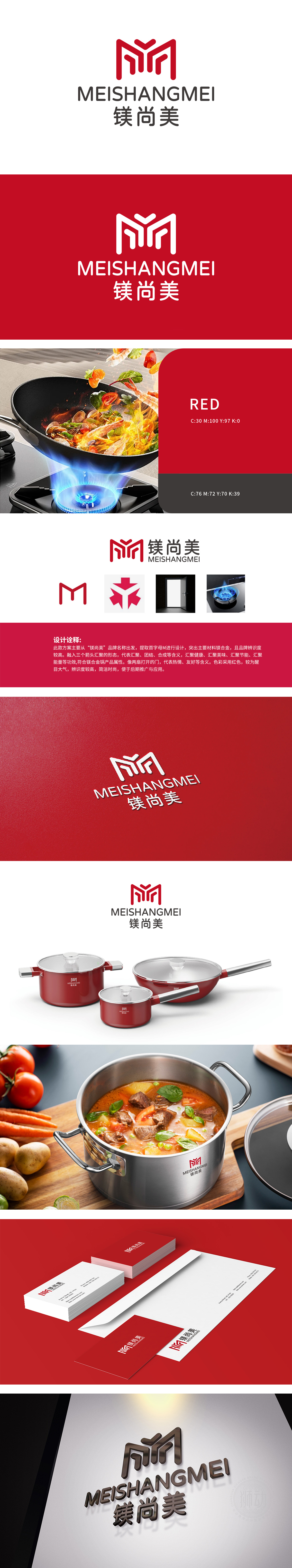
狮动为镁尚美公司打造的LOGO以品牌首字母“M”为核心,通过几何造型与向上箭头组合,象征稳健与创新突破。红色主色调传递活力与专业感,简洁设计兼顾视觉冲击力与品牌辨识度。LOGO融合中英文名称,强化国际化形象,整体风格现代大气,精准传达镁尚美“锐意进取”的企业理念,助力品牌在市场中脱颖而出。
The LOGO created by Lion Motion for Magnesium Shangmei Company takes the brand initials "M" as the core, and through the combination of geometric modeling and upward arrow, it symbolizes stability and innovation breakthrough. The main color of red conveys vitality and professionalism, and the simple design gives consideration to visual impact and
brand recognition. LOGO combines Chinese and English names, strengthens the international image, has a modern overall style, accurately conveys the corporate philosophy of "forging ahead" of magnesium and beauty, and helps brands stand out in the market.


扫码或拨打添加客服微信


