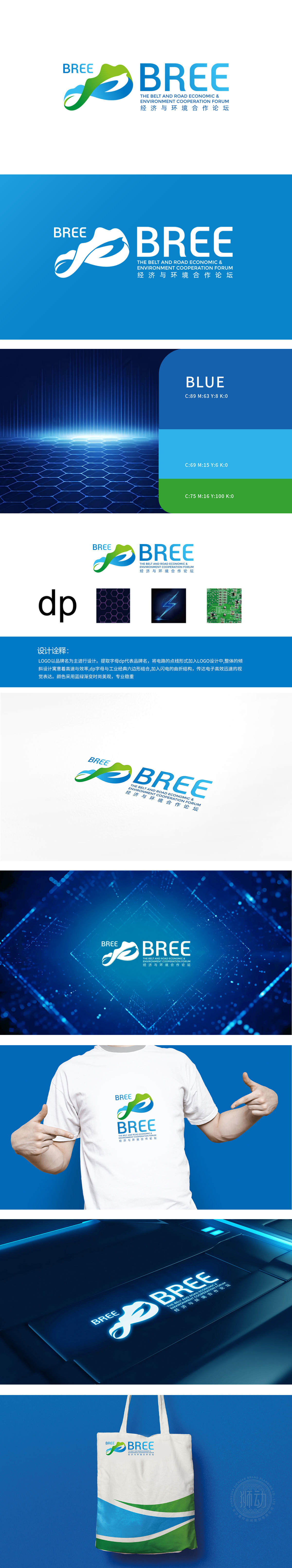
狮动以蓝绿主色调呼应“经济-环境”双轨价值,灵动曲线融合“山水轮廓”与“纽带形态”,既传递生态底色,又显合作互联的延展性;中英文字体简约大气,强化国际传播属性。从理念拆解到视觉符号落地,狮动让“共荣共生”的论坛定位直观可感,助力BREE在全球合作场景中快速建立辨识度——精准、灵动的设计逻辑,正是狮动为品牌造“魂”的底气。
Lion dance echoes the dual-track value of "economy-environment" with the main color of blue and green, and the smart curve integrates "landscape outline" and "bond form", which not only conveys the ecological background, but also shows the extensibility of cooperation and interconnection; Chinese and English fonts are simple and atmospheric, which strengthens the international communication attribute.


扫码或拨打添加客服微信


