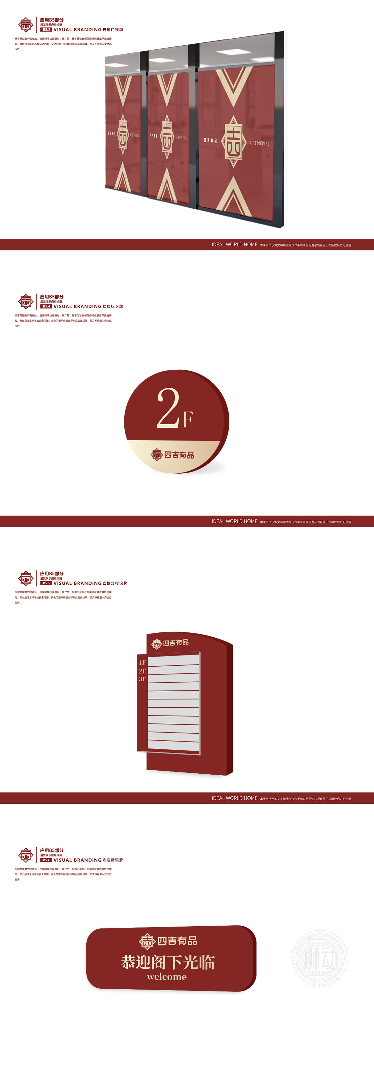
狮动以东方美学为核心,将传统回纹框架与“吉”字意象融于图形,方正线条碰撞圆润笔画,诠释“守正创新”内核;品牌名字体兼顾古韵与现代识别性,绛红底色搭配暖金视觉,精准传递“东方品质生活提案者”定位。从传统意涵溯源,到“有品”生活场景的落地延伸,狮动通过符号解构衔接文化脉络,让LOGO成为品牌价值的可视化锚点。其对传统元素现代表达的精准度、“视觉+故事”双维赋能的专业度,既验证设计实力,也为四吉有品后续品牌资产沉淀筑牢根基。
Lion Dance takes oriental aesthetics as the core, and integrates the traditional palindrome frame and the image of "auspicious" into graphics, and the square lines collide with rounded strokes to interpret the core of "keeping upright and innovating"; Brand name fonts give consideration to both ancient rhyme and modern recognition, and the crimson background is matched with warm gold vision to accurately convey the positioning of "Oriental quality life proponent". From the origin of the traditional meaning to the extension of the "quality" life scene


扫码或拨打添加客服微信