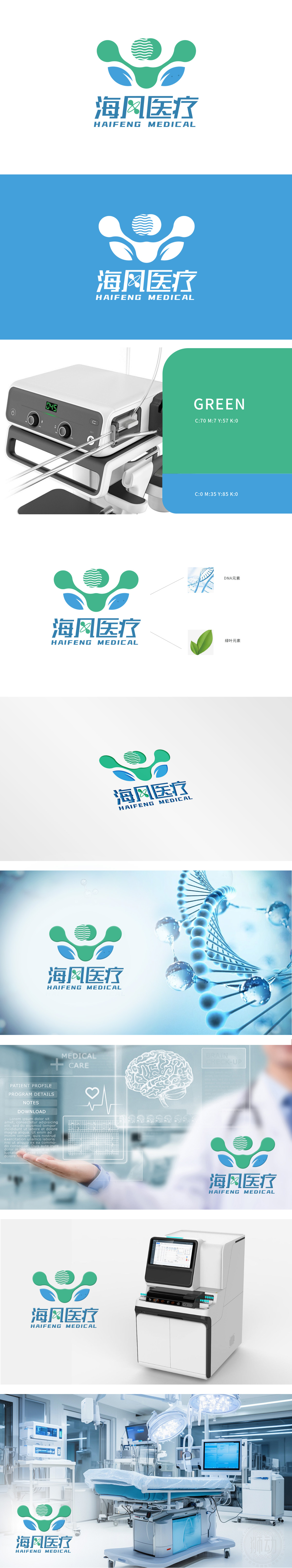
狮动为海风医疗打造的logo,精准捕捉医疗行业专业与温度并存的特质。以人形轮廓传递守护关怀,头部波浪纹呼应“海风”之名,绿蓝双色碰撞诠释健康与自然的理念。向上伸展的双臂化作活力圆球,双手点缀生态叶片,象征生命蓬勃。整体设计简洁而富有张力,让品牌精神一目了然.
The logo created by Lion Motion for Haifeng Medical accurately captures the characteristics of the coexistence of professionalism and temperature in the medical industry. The human figure is used to convey the protective care, the wavy pattern on the head echoes the name of "sea breeze", and the collision of green and blue colors interprets the concept of health and nature. The arms stretched upward turn into dynamic spheres.


扫码或拨打添加客服微信


