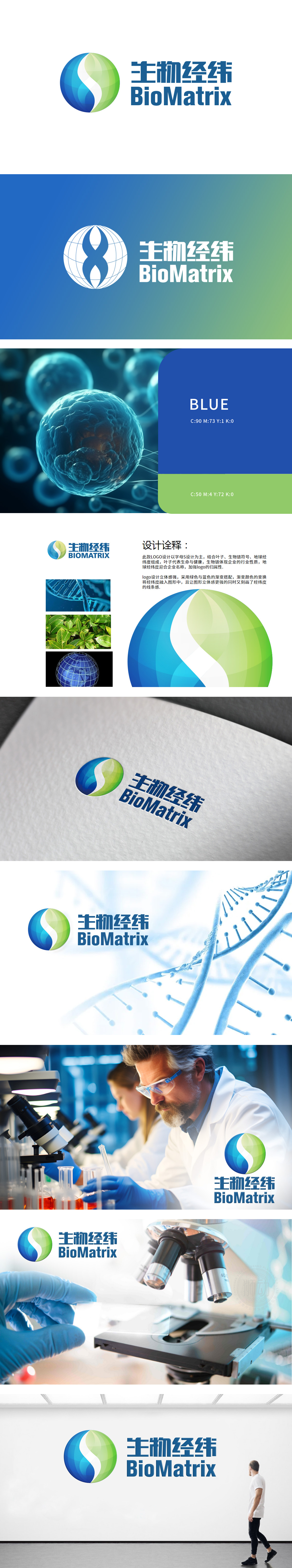
狮动设计的“生物经纬BioMatrix”logo,以蓝绿双色呈现科技与自然的融合,波浪线条象征生命活力与数据流动。我们精准捕捉医疗行业的专业特质,将品牌理念转化为视觉符号:圆形图标传递信任感,动态线条展现创新力。作品获客户高度认可,有效提升品牌辨识度,助力其在竞争激烈的市场中脱颖而出。狮动——用设计诠释医疗温度与科技力量!
The "Bio-matrix" logo designed by Lion Motion shows the integration of technology and nature in blue and green colors, and the wavy lines symbolize vitality and data flow. We accurately capture the professional characteristics of the medical industry and transform the brand concept into visual symbols: circular icons convey trust and dynamic lines show innovation. The works are highly recognized by customers, which effectively enhances brand recognition and helps them stand out in the highly competitive market.


扫码或拨打添加客服微信


