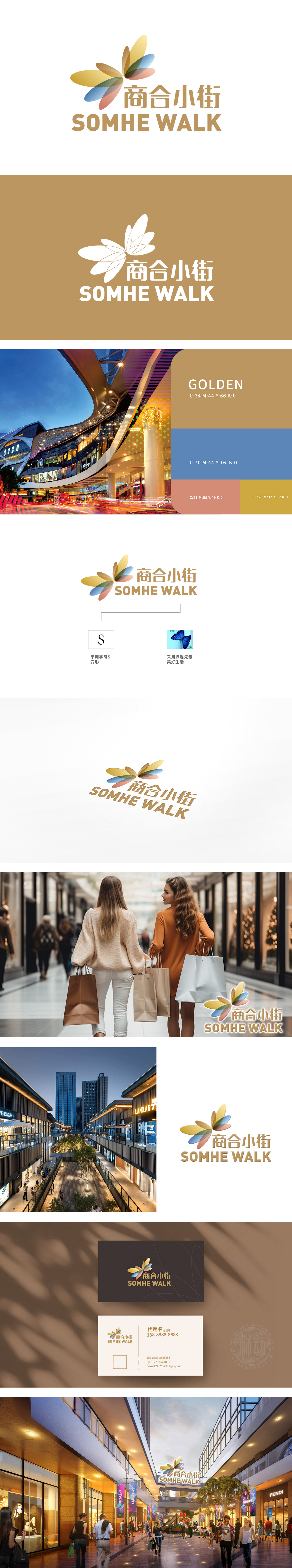
狮动设计打造“商合小街”logo。设计以四瓣渐变花卉象征商业多元融合,色彩流动寓意活力与前景;字体选用简洁线条,呼应现代商业街的秩序感。客户对狮动精准捕捉品牌内核、将“合作共赢”理念可视化赞不绝口,称其“既美观又充满商业张力,让人一眼看到街区未来繁荣”。
Lion design creates "Shanghe Street" logo. The design uses four-petal gradually changing flowers as a symbol of commercial multi-integration, and the color flow symbolizes vitality and prospect; The font uses simple lines, echoing the sense of order in modern commercial streets. Customers praised Lion Motion for accurately capturing the brand core and visualizing the concept of "win-win cooperation", calling it "both beautiful and full of commercial tension, which makes people see the future prosperity of the block at a glance".


扫码或拨打添加客服微信


