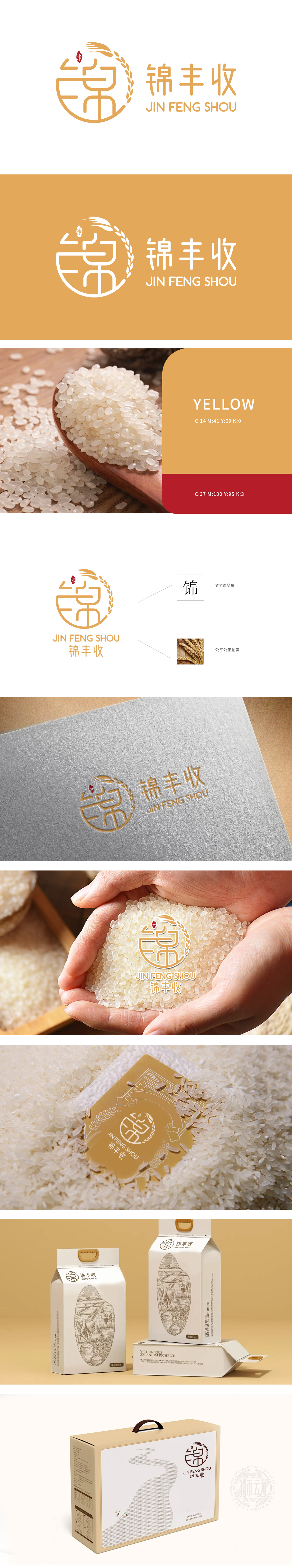
狮动为农业公司锦丰收设计的品牌logo,以麦穗元素勾勒丰收意象,抽象线条注入活力,红“米”字图标强化行业属性。橙黄主色调呼应阳光与大地,整体简洁大气,精准传递“丰收、信赖、创新”的品牌核心。该设计落地后,客户品牌形象显著提升,市场反响热烈,成功助力业务增长。狮动以专业洞察与创意表达,为农业品牌打造差异化视觉符号,赢得行业认可!
The brand logo designed by Lion Motion for the agricultural company Jin Fengshou outlines the harvest image with wheat ear elements, the abstract lines inject vitality, and the red "rice" icon strengthens the industry attributes. The main color of orange and yellow echoes the sunshine and the earth, and the overall simplicity and atmosphere accurately convey the brand core of "Harvest, Trust and Innovation". After the design landed, the brand image of customers was significantly improved, and the market response was enthusiastic, which successfully helped business growth.


扫码或拨打添加客服微信


