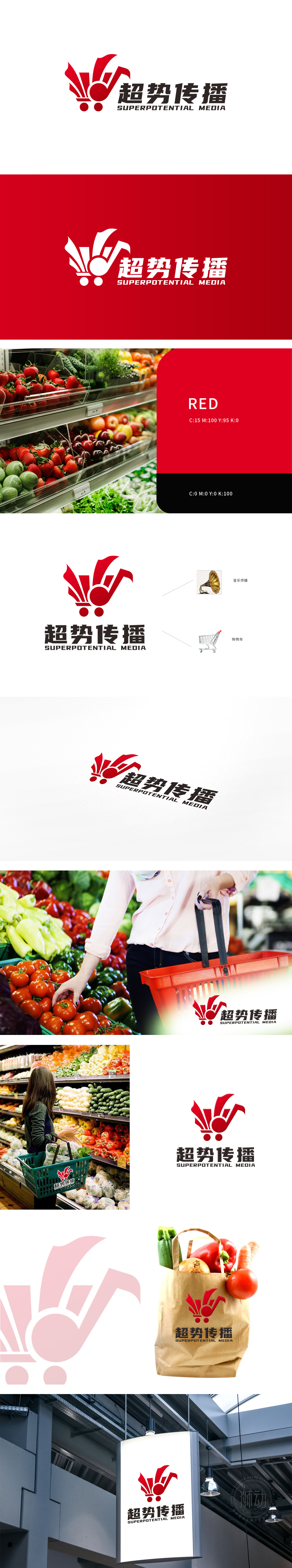
狮动深度挖掘客户需求,以“便捷、活力、多元”为核心理念,巧妙融合购物车与音符,塑造动感视觉符号。红色象征热情服务,黑色凸显专业信赖,整体设计简洁而富有张力。客户对狮动的创意及执行力高度赞赏,新logo显著提升品牌辨识度,成为超市开拓市场的强力名片。
Lions dig deep into customer needs, take "convenience, vitality and diversity" as the core concept, skillfully integrate shopping carts and notes, and create dynamic visual symbols. Red symbolizes warm service, black highlights professional trust, and the overall design is simple and full of tension. Customers highly appreciate.


扫码或拨打添加客服微信


