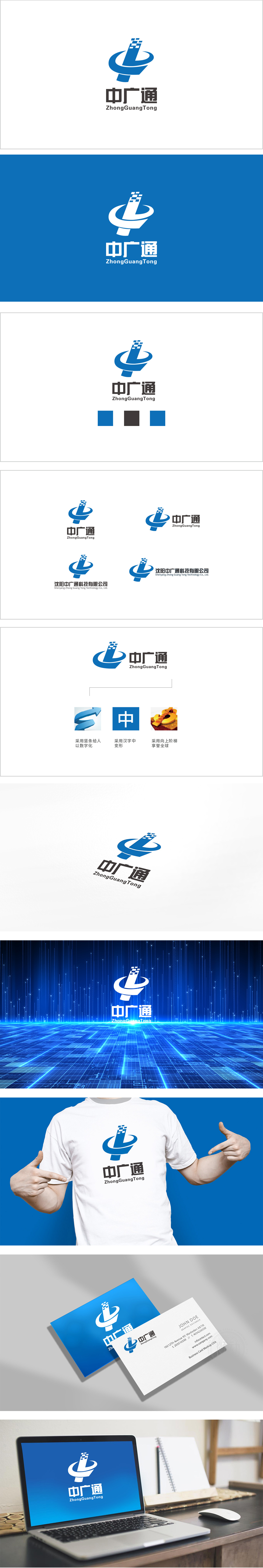
狮动设计采用竖条为图形的“视觉中心”,“中”字的抽象变形,形似通信天线、信号塔,其作用是:强化“通信”的行业属性;借助“竖”的形态传递“挺拔、可靠”的品牌形象;作为“方块群”与“环形”的连接载体,让图形形成“自上而下”的视觉流动(从数据到信号,再到网络)。主色采用深幽蓝,科技感与可靠性的平衡。整体用“符号化语言”翻译了企业的核心业务(通信科技)与价值主张(连接、覆盖、数字化),用视觉讲“企业故事”。
Lion Design adopts vertical bar as the "visual center" of graphics, and the abstract deformation of the word "zhong" looks like a communication antenna and signal tower, and its functions are: to strengthen the industrial attribute of "communication"; Convey the brand image of "upright and reliable" by means of "vertical" form; As the connecting carrier of "block group" and "ring", graphics form a "top-down" visual flow (from data to signal, and then to network). The main color is dark blue, which balances the sense of technology and reliability. The core business (communication technology) and value proposition (connection.


扫码或拨打添加客服微信


