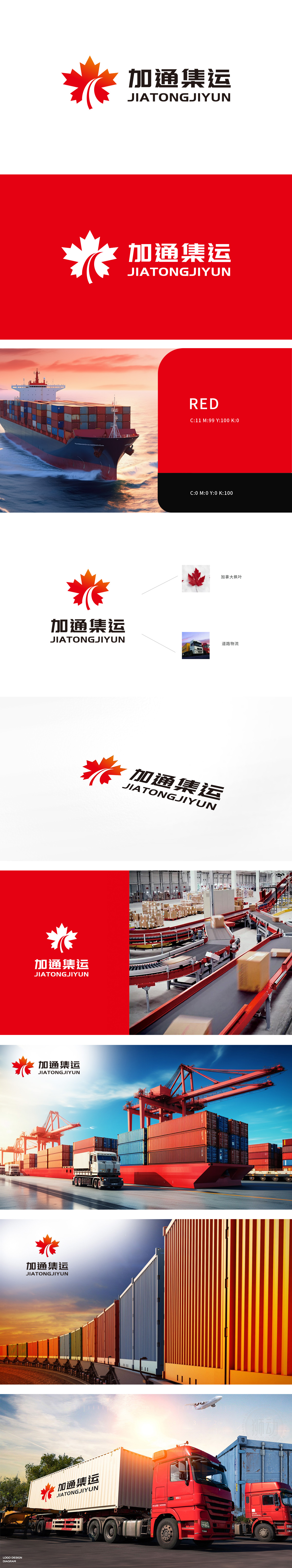
加通集运作为物流的企业,委托狮动打造品牌标识。狮动团队提取枫叶(呼应跨境联结属性)与运输动线核心符号,红橙渐变赋予活力感,流畅线条嵌入枫叶,直观传递“高效集运”服务特质;黑体字标强化行业稳重属性,整体视觉既具地域辨识度,又精准锚定物流行业“速度+可靠”的用户心智。
As a logistics enterprise, Jiatong Container Lines entrusts Lion Movement to create a brand identity. The Lion Movement Team extracts the maple leaf (echoing the cross-border connection attribute) and the core symbols of the transportation line, and the gradual change of red and orange gives a sense of vitality, and the smooth lines are embedded in the maple leaf, intuitively conveying the service characteristics of "efficient container transportation"; Bold characters strengthen the industry's stable attributes, and the overall vision not only has regional recognition.


扫码或拨打添加客服微信


