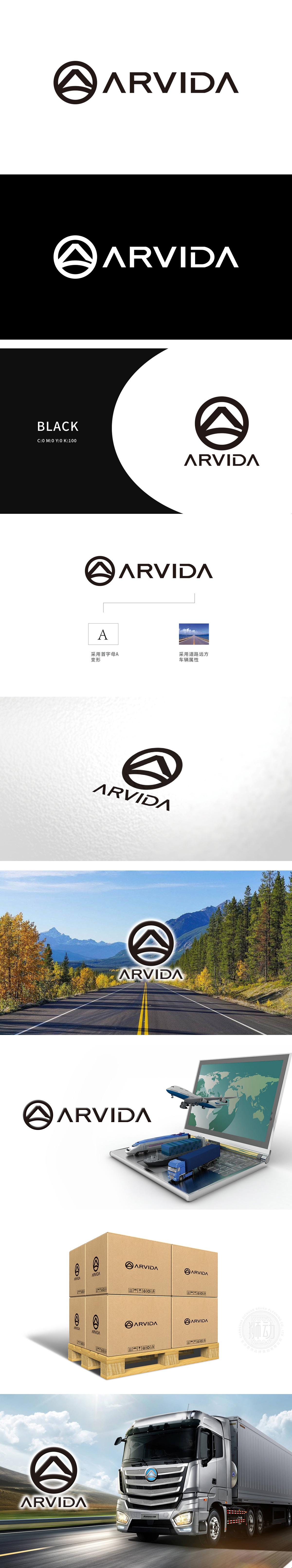
狮动团队深度调研物流行业视觉趋势,以“动态与稳固”为核心理念创作。LOGO以几何山峰象征运输的可靠与稳健,流畅线条勾勒出货物流转的动态轨迹,深棕色配色强化信任感。客户对设计方案赞叹不已,认为LOGO精准契合品牌定位,兼具视觉冲击力与行业深度。
Lion Movement team deeply investigates the visual trend of logistics industry and creates with "dynamic and stable" as the core concept. LOGO symbolizes the reliability and stability of transportation with geometric peaks, smooth lines outline the dynamic trajectory of goods circulation, and dark brown color scheme strengthens trust. Customers are amazed at the design scheme, and think that LOGO fits the brand positioning accurately, with both visual impact and industry depth.


扫码或拨打添加客服微信


