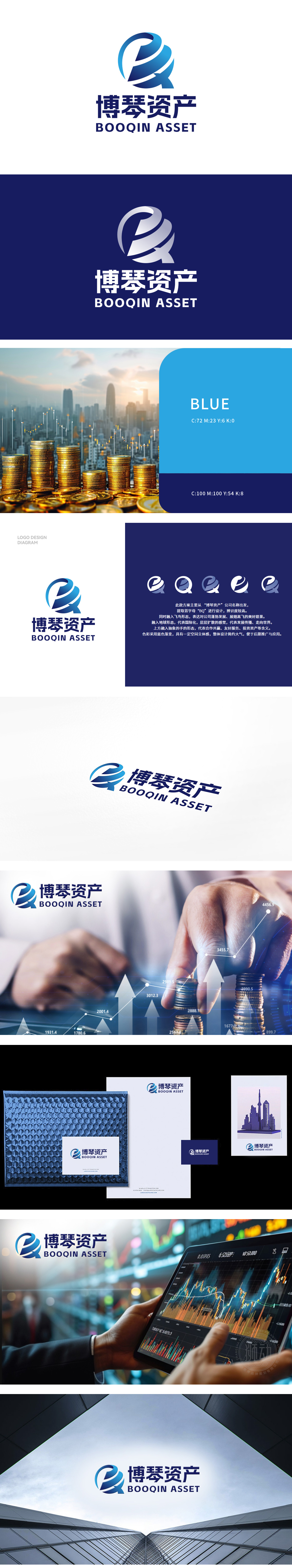
狮动为股票金融财务领域客户「博琴资产」打造的LOGO,精准捕捉行业特质。以交织的“B”与“Q”字母为视觉核心,象征资本协作与增值流动;蓝色渐变传递稳健信任感,同时注入现代活力。字体设计刚柔并济,强化专业形象。
The LOGO created by Lion Motion for Boqin Assets, a customer in the stock finance field, accurately captures the characteristics of the industry. With the interwoven letters "B" and "Q" as the visual core, it symbolizes capital cooperation and value-added flow; The blue gradient conveys a steady sense of trust and injects modern vitality. Font design combines rigidity and softness to strengthen professional image.


扫码或拨打添加客服微信


