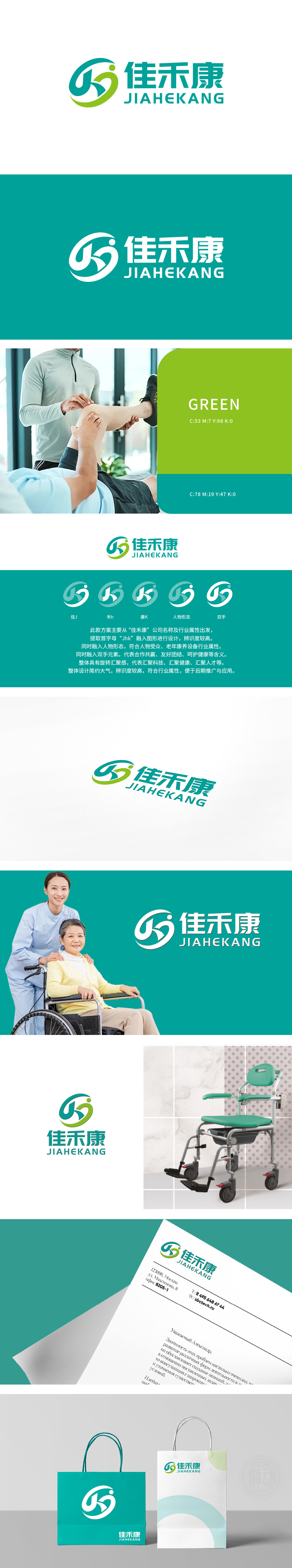
狮动团队精准锚定“老人照护”核心需求,以灵动人形符号传递陪伴关怀,青绿色系交融迸发生机与安心感;字体设计兼顾亲和力与辨识度,强化“专业守护银发生活”的品牌主张。从视觉符号到情感共鸣,狮动让设计与养老服务的温度、专业深度同频,助力佳禾康快速建立赛道记忆点。
The lion movement team accurately anchors the core needs of "care for the elderly", conveys companionship and care with smart humanoid symbols, and the green department blends generate's vitality and peace of mind; Font design gives consideration to affinity and recognition, and strengthens the brand proposition of "professional protection of silver-haired life" From visual symbols to emotional resonance.


扫码或拨打添加客服微信


