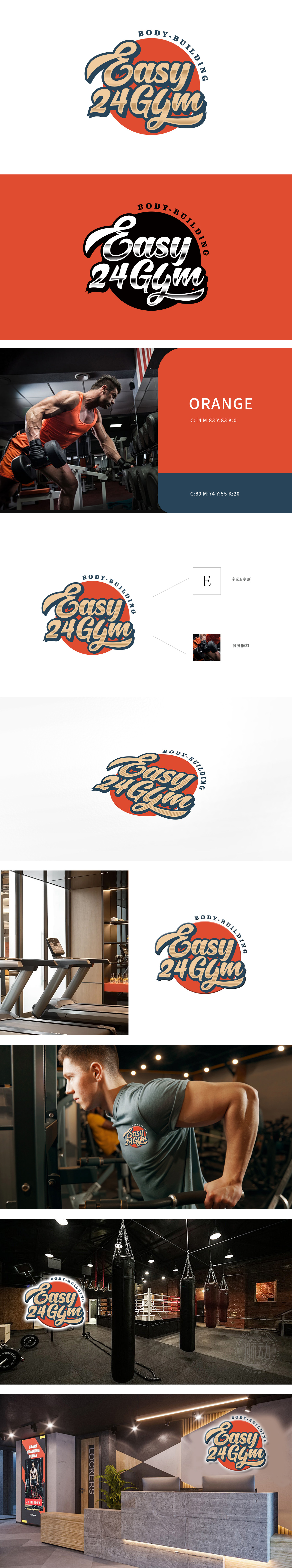
LOGO以复古欧式手写字体呈现“Easy 24 Gym”,笔画粗细变化彰显力量感,曲线走势又传递运动活力;红色圆底烘托热情氛围,“BODY - BUILDING”环绕布局强化健身属性。从字体骨骼到色彩情绪,狮动精准锚定“力量活力欧式美学”的品牌内核,用视觉语言完美诠释健身行业的热血与专业,让品牌辨识度与精神主张同步落地。
LOGO presents "Easy 24 Gym" in retro European handwriting font, and the change of stroke thickness highlights the sense of strength, and the curve trend conveys the vitality of sports; The red round bottom sets off the warm atmosphere, and the "BODY-BUILDING" surrounding layout strengthens the fitness attribute. From the font skeleton to the color emotion, Lion Motion accurately anchors the brand core of "European Aesthetics of Strength and Vitality", perfectly interprets the blood and specialty of the fitness industry with visual language.


扫码或拨打添加客服微信


