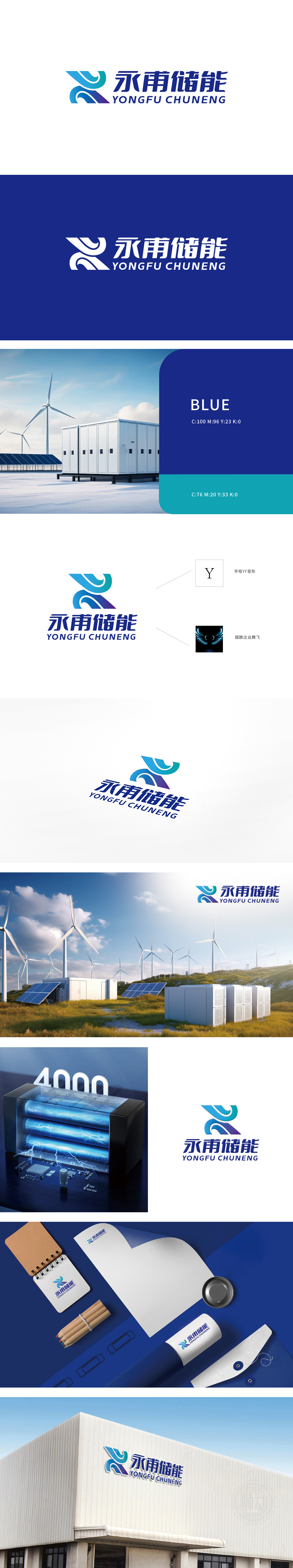
狮动设计团队为永甫储能打造的LOGO,以“能量流动与科技融合”为核心理念。图形采用交织的弧形设计,象征能量循环与持续创新,蓝色渐变凸显科技感与稳定性。中英文组合强化品牌国际化定位,字体选择兼顾专业性与辨识度。整体设计精准传递企业储能领域的专业形象。
The LOGO created by Lion Design Team for Yongfu Energy Storage takes "energy flow and technology integration" as the core concept. The graphic adopts interlaced arc design, symbolizing energy cycle and continuous innovation, and the blue gradient highlights the sense of science and technology and stability. The combination of Chinese and English strengthens the international positioning of the brand, and the font selection takes into account professionalism and recognition.


扫码或拨打添加客服微信


