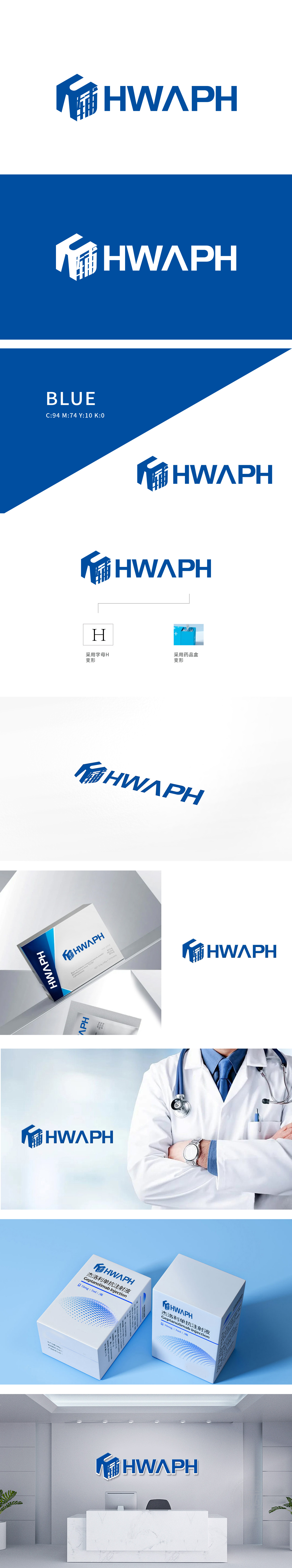
狮动设计引领行业新篇章,此次狮动为某药辅公司设计LOGO,以“稳定可靠的药物辅助”为核心概念。主色调采用冷静专业的蓝色,几何图形搭配镂空文字,寓意坚实守护与精密技术结合。简洁现代的视觉语言,精准传递企业“安全、高效、创新”的价值主张。狮动设计,深谙品牌内核,以独到创意助力企业脱颖而出。
Lion design leads a new chapter in the industry. This time, Lion design LOGO for a pharmaceutical auxiliary company, with "stable and reliable pharmaceutical auxiliary" as the core concept. The main color is calm and professional blue, and the geometric figures are matched with hollow words, which means the combination of solid protection and precision technology. Simple and modern visual language accurately conveys the value proposition of "safety, efficiency and innovation" of enterprises. Lion design, well versed in the core of the brand, helps enterprises stand out with unique creativity.


扫码或拨打添加客服微信


