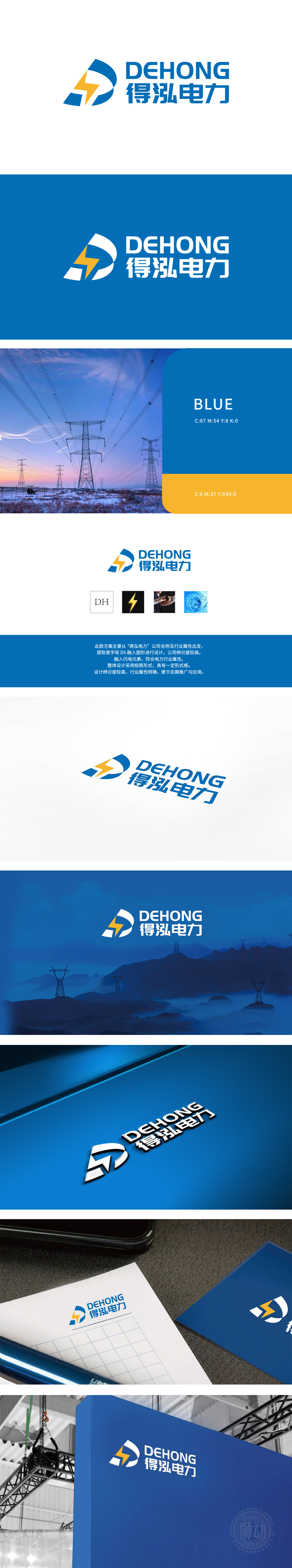
得泓电力委托狮动设计的LOGO,以抽象“D”字母与闪电符号巧妙融合,深邃的蓝色主色调既传递科技感又象征电力行业的稳健与信任。闪电形态代表能量迸发与行业创新,D形结构如磐石般稳固,直观诠释品牌专业实力与可靠承诺。创作中,狮动精准捕捉品牌核心价值,将行业属性与视觉美学完美平衡,最终方案以独特造型、超强辨识度及理念共鸣,在多轮提案中脱颖而出,成为客户赋能品牌传播的理想选择。
The LOGO designed by Dehong Power on behalf of Lion Motion is ingeniously integrated with abstract "D" letters and lightning symbols. The deep blue main color not only conveys the sense of technology, but also symbolizes the stability and trust of the power industry. The lightning shape represents energy generate and industry innovation, and the D-shaped structure is as solid as a rock, which intuitively interprets the brand's professional strength and reliable commitment. In the creation.


扫码或拨打添加客服微信


