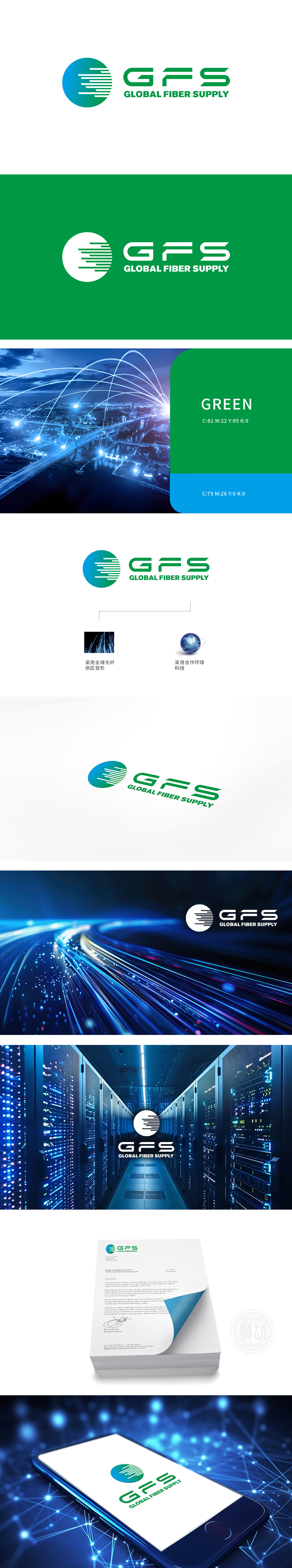
狮动设计采用圆形设计,象征完整与无限,传达出全球覆盖和持续服务的理念。渐变色(蓝绿),蓝色代表科技与信任,绿色象征环保与温暖,整体传达出科技与自然。内部线条流畅且富有动感,象征数据传输的高速与稳定性,体现通信行业的特性。Logo设计现代简约,色彩搭配和线条运用突显科技行业的前沿性和专业性。简洁而不失细节的设计,视觉效果出众。
Lion design adopts circular design, which symbolizes completeness and infinity and conveys the concept of global coverage and continuous service. Gradient color (blue-green), blue represents technology and trust, green symbolizes environmental protection and warmth, and conveys technology and nature as a whole. The internal lines are smooth and dynamic, symbolizing the high speed and stability of data transmission and embodying the characteristics of the communication industry.


扫码或拨打添加客服微信


