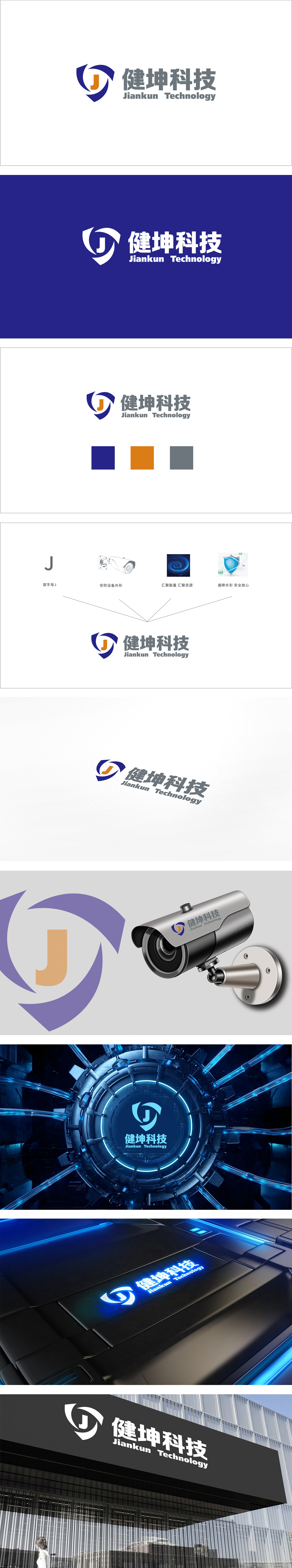
狮动设计以“健坤”拼音首字母“J”为视觉核心,将其设计为旋转的箭头形态,既保留了字母的高识别性,又通过“旋转”暗示“动态监控”或“数据流转”,符合安防系统“持续运行、实时响应”的特性。色调采用冷色调(深蓝+浅灰),蓝色象征“科技、信任、安全”,符合安防企业“可靠、专业”的形象;整体通过“基础识别-行业属性-价值传递-理念落地”的四层元素,符合安防行业“严谨、可追溯”的特质。
Lion Design takes the first letter "J" of "Jiankun" as the visual core, and designs it as a rotating arrow shape, which not only retains the high recognition of letters, but also implies "dynamic monitoring" or "data flow" through "rotation", which conforms to the characteristics of "continuous operation and real-time response" of security system. The color tone is cool (dark blue+light gray), and blue symbolizes "technology, trust and safety", which conforms to the image of "reliable and professional" of security enterprises.


扫码或拨打添加客服微信


