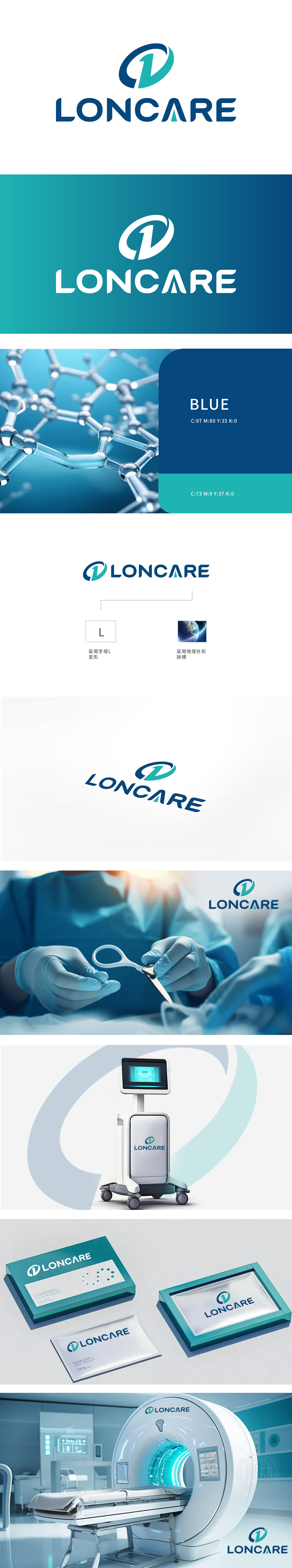
狮动设计采用圆形,象征完整、循环和持续,传达出“长久(LON)”的理念,公司的服务或产品具有持久性和可靠性。数字“1”:位于圆形内部,强调“第一”或“领先”的概念,表明公司在行业中的领先地位或对卓越的追求。深蓝色代表信任、稳定和专业,常用于医疗、科技等行业,传递出可靠和安全的感觉。浅绿色象征健康、关怀和环保,狮动在LOGO设计中展现了深厚的专业功底,从图形寓意到色彩搭配,每一个细节都经过精心设计,体现了高水准的设计能力。
Lion design adopts a circle, symbolizing integrity, circulation and continuity, and conveying the concept of "LON". The company's services or products are durable and reliable. Number "1": located inside the circle, it emphasizes the concept of "first" or "leading", indicating the company's leading position in the industry or its pursuit of Excellence. Dark blue represents trust, stability and professionalism, and is often used in medical, scientific and technological industries to convey a sense of reliability and security. Light green symbolizes health, CARE and environmental protection. "LONCARE" combines the words "LON" and "CARE" to convey .


扫码或拨打添加客服微信


