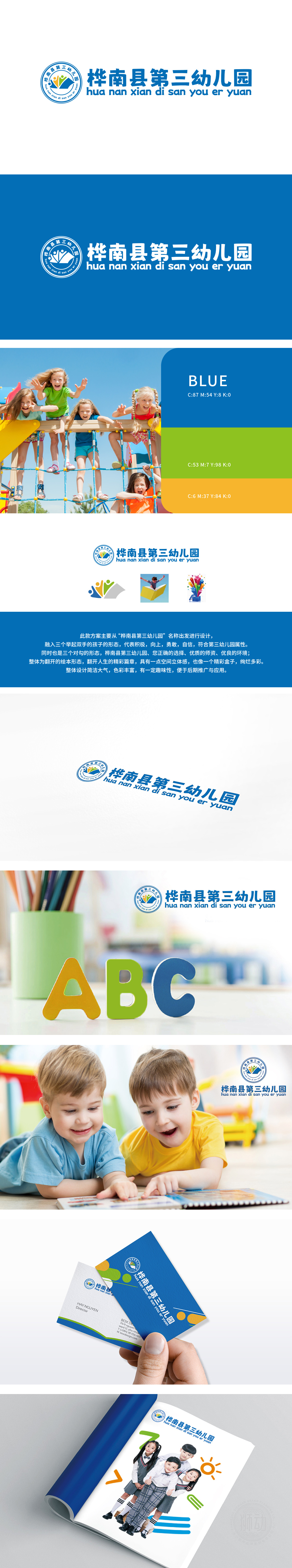
狮动设计以 以“童真成长”为核心理念。圆形徽标中,三色人形手拉手象征孩子间的友谊与合作,象征儿童互助成长,,蓝色山峰背景寓意坚实教育基石,山形与弧线寓意守护成长、迈向未来;蓝白配色传递温馨与信任,,拼音“HNSY”点缀右下角,既强化地域属性(桦南县),又凸显教育品牌专属感。创作融合童趣与专业感,客户高度认可其“寓教于形”的理念,认为设计既捕捉了园所的核心价值,又兼具辨识度与传播力。
Lion dance design takes "childlike growth" as the core concept. In the circular logo, the three-color humanoid hand in hand symbolizes the friendship and cooperation between children, symbolizing the mutual growth of children, and the blue mountain background symbolizes a solid educational cornerstone, while the mountain shape and arc symbolize guarding growth and marching towards the future; The blue and white color scheme conveys warmth and trust, and the pinyin "HNSY" adorns the lower right corner.


扫码或拨打添加客服微信


