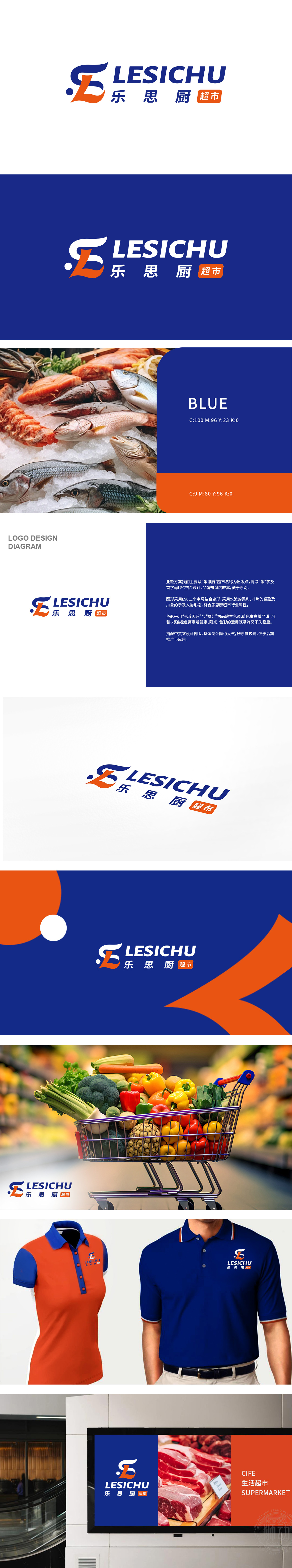
狮动设计Logo由一个橙色和蓝色组成的“L”字母构成,橙色部分流畅且富有动感,蓝色部分则稳重且现代,二者结合展现出品牌的活力与专业性。蓝色调给人以信任和可靠的感觉。橙色:代表热情、活力和吸引力,能够迅速抓住消费者的眼球,传递出超市的热闹和丰富。Logo整体设计简洁明了,易于识别和记忆,符合现代品牌设计的审美趋势。
Lion design Logo consists of an "L" letter composed of orange and blue. The orange part is smooth and dynamic, while the blue part is stable and modern. The combination of the two shows the vitality and professionalism of the brand. The blue tone gives people a feeling of trust and reliability. Orange: It represents enthusiasm, vitality and attraction, and can quickly catch consumers' eyes and convey the excitement and richness of the supermarket.


扫码或拨打添加客服微信


