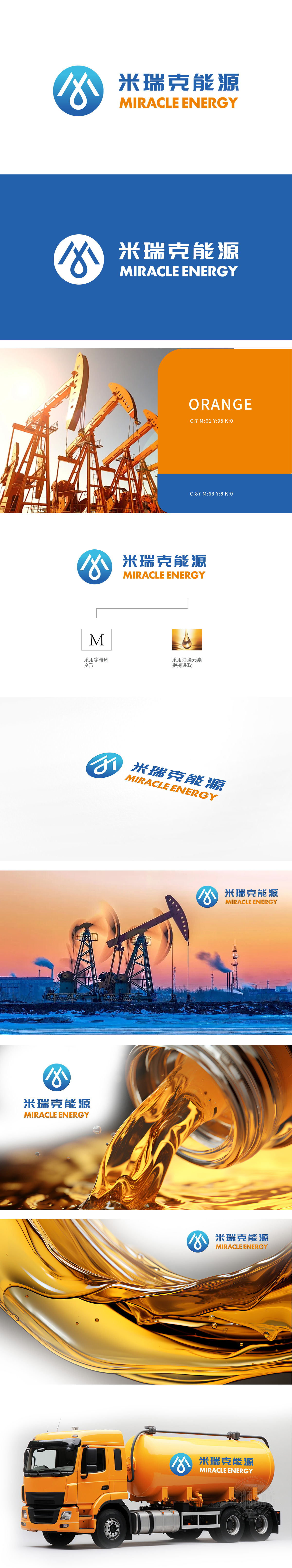
狮动设计以水滴象征着纯净、生命和可持续性,使用了蓝色和橙色。蓝色通常代表信任、稳定和科技感,而橙色则传递出活力、创新和热情,两者的结合既专业又充满活力。强调其创新能力和可持续发展理念。通过简洁明了的图形和鲜明的色彩搭配,吸引客户的注意力,传递出公司的专业性和可靠性。Logo成功地将米瑞克能源的化工能源和环保理念融入设计中,精准传达了品牌的核心价值。
Lion design uses water droplets to symbolize purity, life and sustainability, and uses blue and orange. Blue usually represents trust, stability and sense of technology, while orange conveys vitality, innovation and enthusiasm. The combination of the two is both professional and full of vitality. Emphasize its innovative ability and sustainable development concept. Through simple and clear graphics and bright color matching, it attracts customers' attention and conveys the professionalism and reliability of the company.


扫码或拨打添加客服微信


