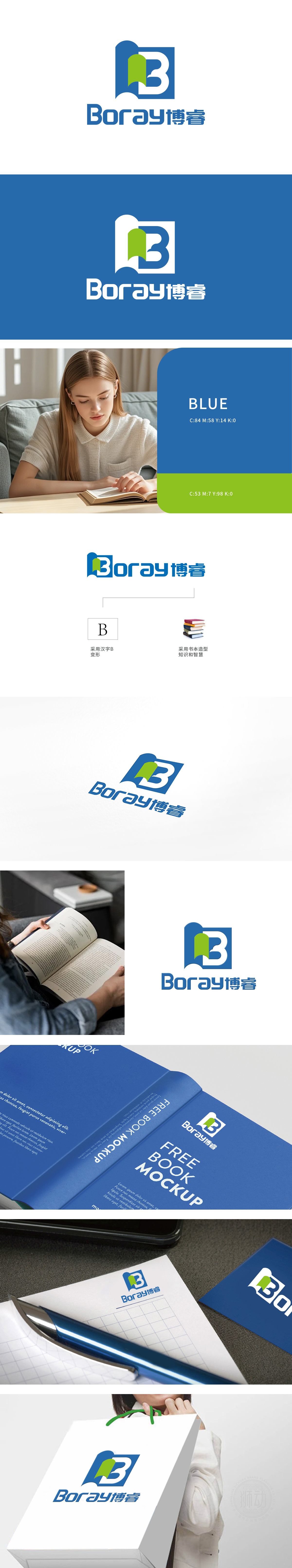
狮动设计的博睿Logo以简约而富有张力的视觉语言,构建了品牌的核心,以书页为灵感,直观呼应“博睿”中蕴含的智慧、学习与成长理念。绿色注入生机,暗示品牌持续探索、开拓新领域的姿态。聚焦“博睿”——“博”代表广博学识,“睿”象征睿智洞察翻页的动态感引发“开启新知”的联想,与目标受众(如企业客户/知识型用户)对“专业赋能”的期待形成情感联结。整体构图平衡且富有层次,色彩碰撞中传递出专业性与人文气息的交融,彰显品牌独特气质。
The Borui Logo designed by Lion Motion builds the core of the brand with a simple and tense visual language, and intuitively echoes the wisdom, learning and growth ideas contained in "Borui" with the inspiration of pages. Green injects vitality, suggesting that the brand continues to explore and open up new fields. Focus on "Bo Rui"-"Bo" stands for extensive knowledge and "Rui" stands for wise insight.The dynamic feeling of turning pages leads to the association of "opening new knowledge" and forms an emotional connection with the expectation .


扫码或拨打添加客服微信


