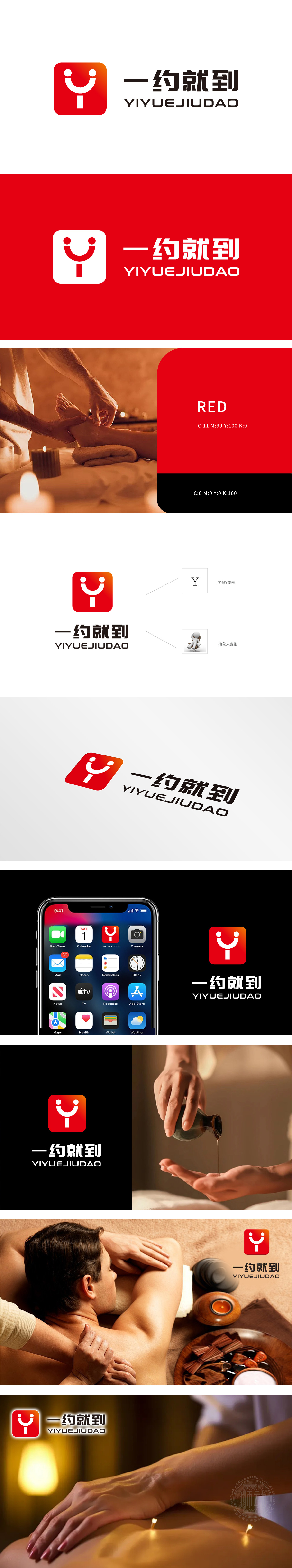
狮动设计从用户体验出发,LOGO左侧采用了一个红色渐变的方形图案,内含一个简洁的笑脸图案和一个“Y”字母。笑脸象征着愉悦和满意,传达了使用该APP能够带来愉快的按摩体验;“Y”字母则巧妙地与品牌名称“一约就到”中的“约”字相呼应,强化了品牌记忆点。红色渐变色传递出热情、活力和温暖的感觉,符合按摩服务给人的放松和舒适感,能够吸引用户的注意力并留下深刻印象。右侧的“一约就到”四个字简洁明了,表达了该APP便捷、高效的服务特点,即用户只需简单预约,服务即可迅速到达。此LOGO采用笑脸图案能够引发用户的情感共鸣,传递正面情绪,增强用户对品牌的喜爱和信任。
Lion design starts from the user experience, and the left side of the LOGO adopts a square pattern with a red gradient, which contains a simple smiling face pattern and a "Y" letter. The smiling face symbolizes pleasure and satisfaction, and conveys that using the APP can bring a pleasant massage experience; The letter "Y" skillfully echoes the word "about" in the brand name "about to arrive", which strengthens the brand memory. The red gradient conveys the feeling of enthusiasm, vitality and warmth, which accords with the relaxation and comfort of massage service and can attract the attention of users and leave a deep impression.


扫码或拨打添加客服微信


