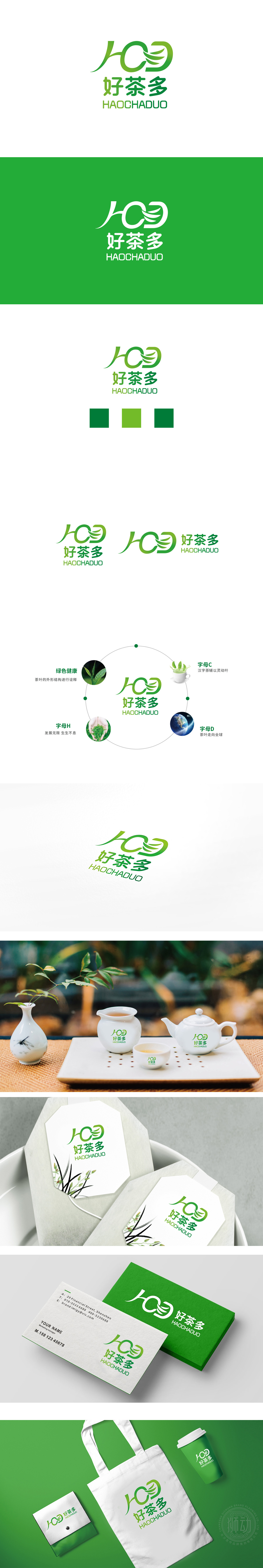
狮动设计将字母变形为具象图形,并围绕"茶的本质-品牌体验-发展愿景"形成环状布局,让观众从"认知产品"到"理解品牌"再到"认同愿景",形成逻辑闭环:将H(好)变形为"生长的茶芽/托举的双手"、**C(茶)**变形为"盛茶的杯盏/舒展的叶片"、D(多)变形为"展开的翅膀/全球的脉络",三者组合成"茶芽生长"的动态形态,直接传递"茶"的生命力与品牌的核心业务。以绿色为主色调(浅绿→深绿渐变),绿色是茶叶的"天然色",传递"自然、健康"的感觉,整体用设计讲好品牌故事",而且说得"生动、清楚、有记忆点"。
Lion Design transforms letters into concrete figures, and forms a circular layout around "the essence of tea-brand experience-development vision", which allows the audience to change from "cognitive product" to "understanding brand" and then to "agreeing with vision", forming a logical closed loop: transforming H (good) into "growing tea buds/lifting hands" and **C (tea) into * *. With green as the main color (light green → dark green gradient), green is the "natural color" of tea, which conveys the feeling of "nature and health", and tells the brand story with design as a whole, and it is "vivid, clear and memorable".


扫码或拨打添加客服微信


